BOSCO
UI + UX
BOSCO Marketing distribution platform
Bosco is a platform designed to simplify the process of allocating marketing budgets for businesses. It serves as a centralised hub that stores data on how effectively your company has responded to various advertising channels. By analysing this data, Bosco provides valuable insights and recommendations on how to optimise your marketing spend in the future. With Bosco, businesses can make informed decisions and allocate their resources more efficiently, ultimately maximising their return on investment.
Objective
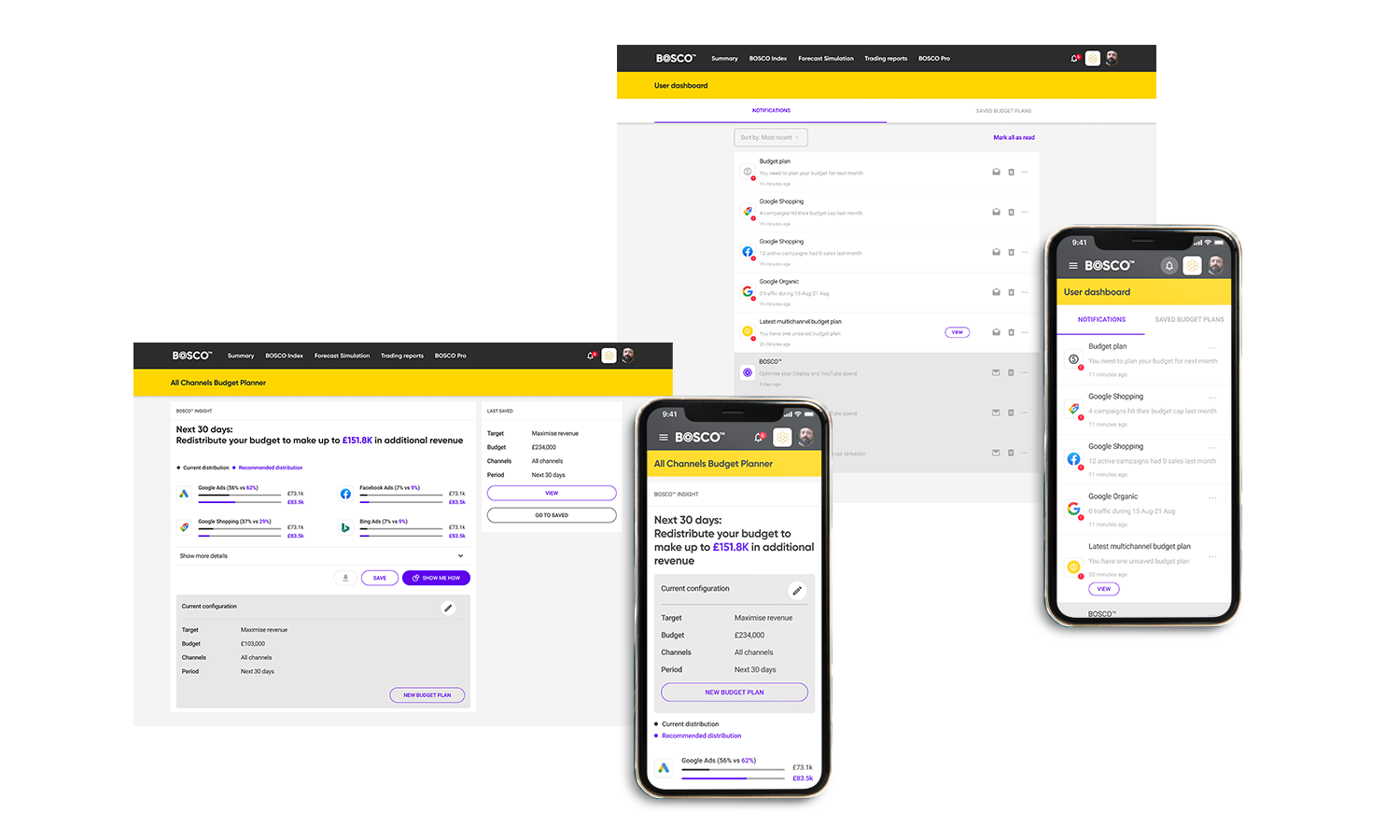
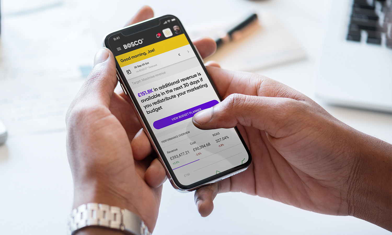
To design the Budget planner tool
What to tackle
-
Complex platform with lots of information to deliver
-
Numbers and graphs can look overwhelming
-
Complex placing the budget planner in the existing architecture
My expertise
The task at hand was to reassess the user experience (UX) of the platform and evaluate its efficiency. This involved designing a new flow and user interface (UI) specifically for the budget planner tool. The budget plan would consist of various configurations that would generate a customised outcome, providing users with guidance on where to allocate their marketing budget and how to do so effectively. This could involve utilising multiple marketing channels such as social media and Google, or configuring campaigns within platforms like Facebook to determine their effectiveness. Upon taking on this project, I was instantly inspired to enhance the usability of the platform and create something truly impressive that would greatly benefit users.
Mapping the landscape
In close collaboration with the BOSCO team, I delved into understanding the existing product, its architecture, and familiarised myself with the company's background. Equipped with this knowledge, I proceeded to create a comprehensive overview of how the product currently functions and identified areas where new features could be seamlessly integrated. Given that a significant portion of this project was conducted remotely, I utilised Miro as a valuable tool to gather and organise my ideas during the discovery phase. Miro's real-time collaboration capabilities provided an excellent platform for all stakeholders to have visibility and actively participate in the process.
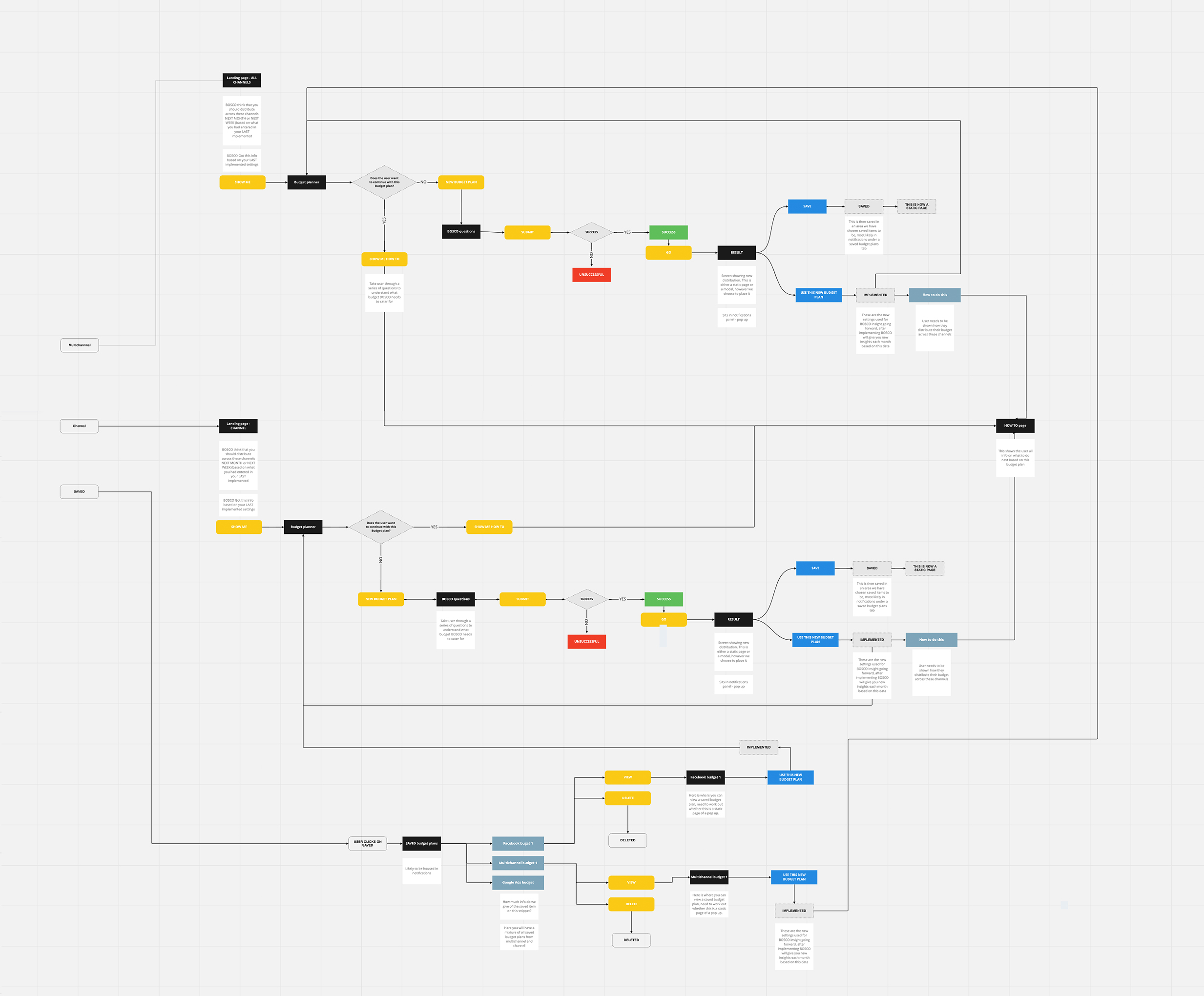
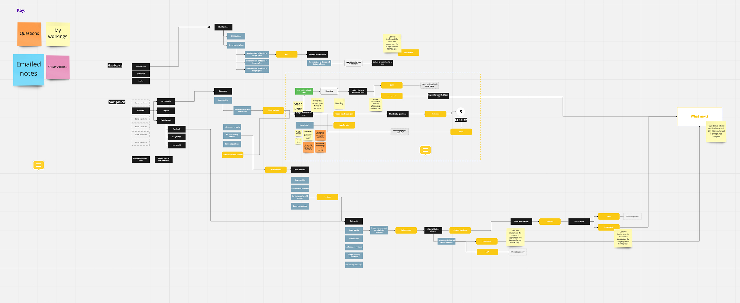
Wireframes and prototype
To provide a comprehensive user journey, I transformed a series of wireframe journeys into a low-fidelity prototype. This allowed for a visual walkthrough of the platform's functionality. Throughout this process, I maintained close communication with the project manager to ensure alignment with project goals. Once we were satisfied with the prototype, it was shared with the BOSCO team for their review. After incorporating their feedback and making necessary adjustments, the prototype was passed on to their overseas development team for implementation.

The primary objective of this project was to enhance the user experience (UX) and user interface (UI) design, ultimately creating an exceptional product tailored specifically for the New York market. The focus was on crafting a solution that would resonate with users in this specific region, taking into account their preferences and expectations. By prioritising UX and UI improvements, we aimed to deliver a standout product that would captivate the target audience and establish a strong presence in the New York market.