Vitality
UI + UX
Improving partner sign up journeys for Vitality members
Vitality is a health insurance company, their business model is the more activity you do the more rewards you receive. These include cinema tickets, coffee, Apple Watch and amazon prime.
The aim
Entice the clients to add particular rewards to their plan and then to track their activity in order for them to receive their reward each week/month. For example: a client could sign up to the Starbucks reward. In their Vitality account they have to link their Starbucks app to their vitality account, achieve 12 points a week which will guarantee them a coffee the following week.
The challenges
-
Different sign up processes per partner
-
Partner integrations with Vitality not all straight forward
-
Various partners to plan ahead to make as similar as possible for ease
-
Predicting future partners to be taken onboard and follow the same pattern
My role
I was the Lead UX/UI designer for this division of the business. I work with the product owner to create solutions on how to present a consistent structure and flow for all partners, allowing for continuity and simplicity despite the different methods of sign up and types of rewards available. This also needs to provide longevity should the partners change in the future. A solution for this has been to create a template that would allow for swappable components. To achieve this I created the partner landing page to display key points in the form of illustration, imagery and keywords with the main call to action being “find out more”. Then an instruction page on how to link your device. Through to a sign up journey and finally a tracking page which will show data we receive, i.e spending, how much they have saved, information on the reward etc.
Planning the project
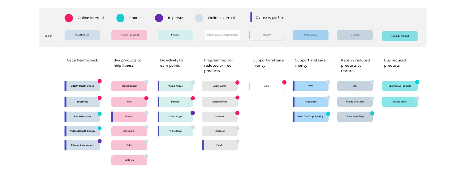
Partners and rewards covers around 20 different journeys however I wanted to figure out the similarities in order to create a standard flow to work for all and to better equip our design system for the future. Here I have looked at all the partners noticing the types and differences, crossovers etc.
Initial wireframes
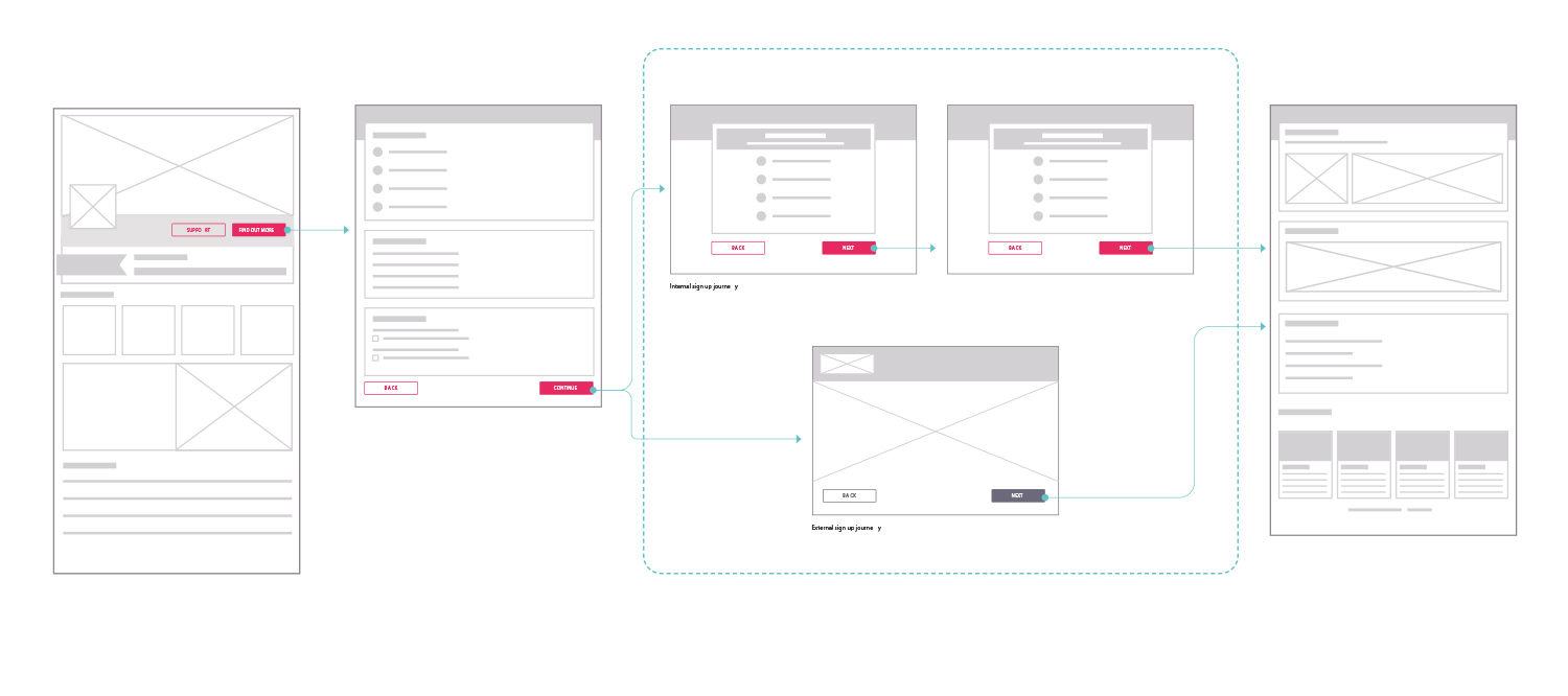
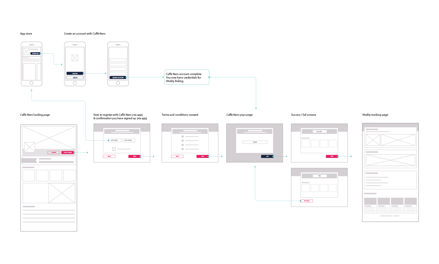
I sketched some wireframes to visualise the pages, noticing there were a lot of similarities, however there were fundamental differences in the ways to sign up, especially if the process is external and out of our hands.
Initial designs
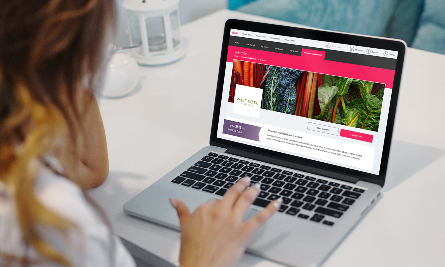
Firstly I tested the approach on Virgin Active as this was a straight forward partner with no complications.
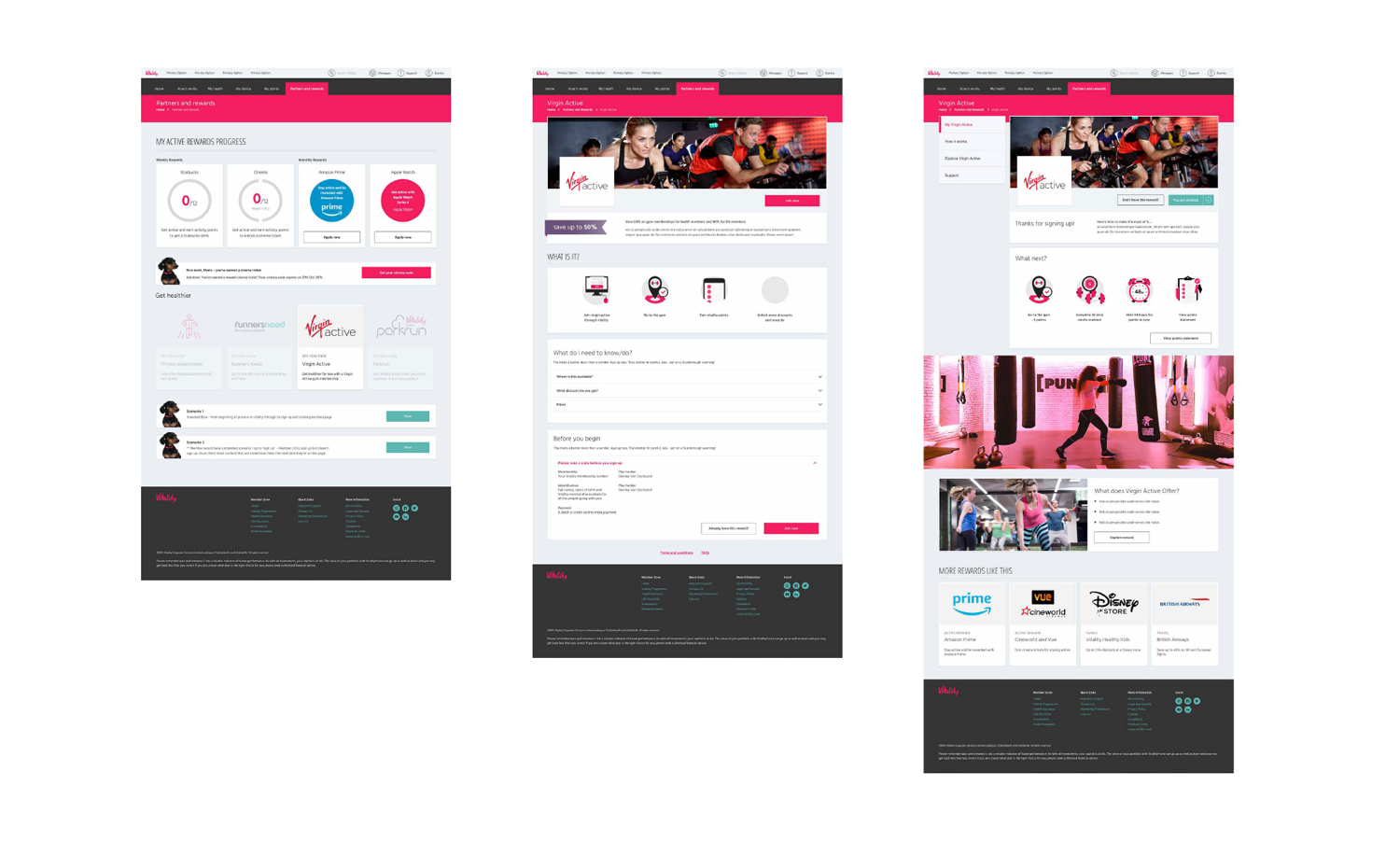
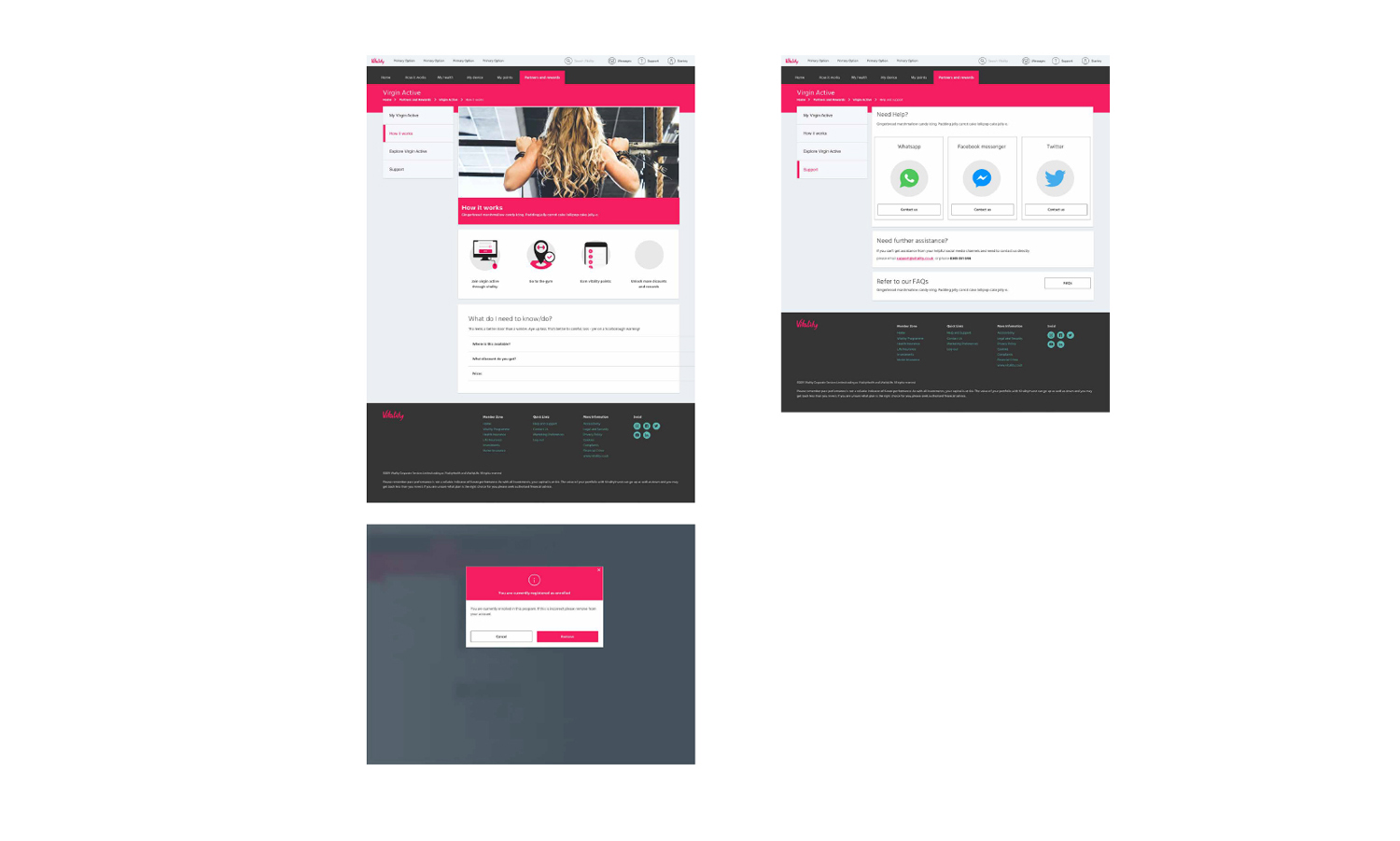
Final template
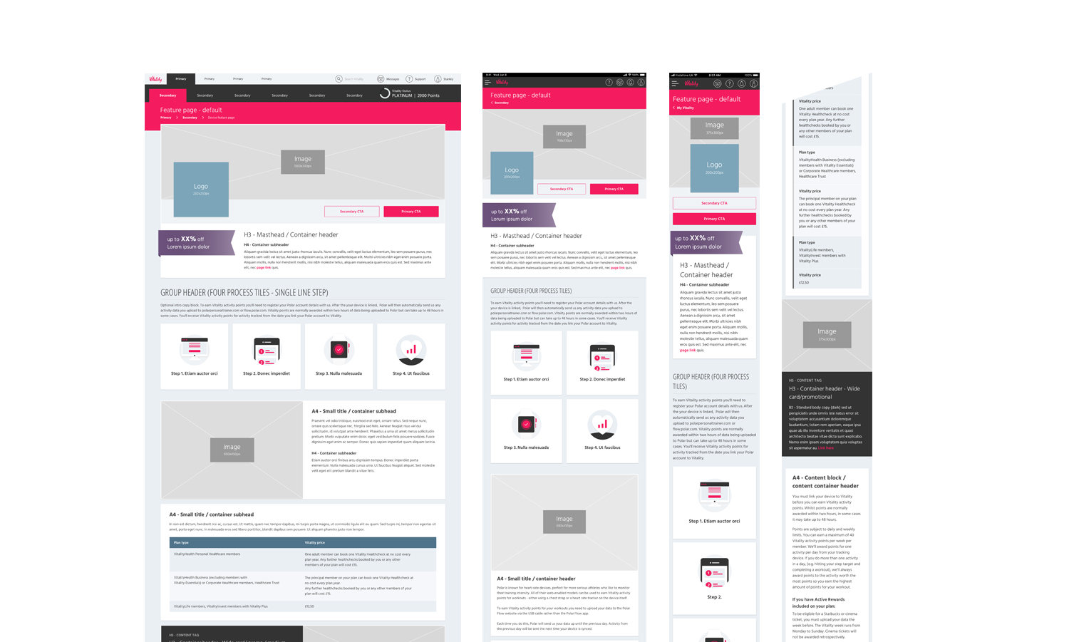
After testing Virgin Active and a few other partners I built out a template that can be used across all the partners, this simplifies the customers experience and less time consuming for front end development.
Template 1 - feature page
This template is for the purpose of partner home screens, which housed any exciting information and to advertise. How signing up would benefit the member, how they sign up easily and how it relates to their programme. The template was built to cover every eventuality, including various components and if some weren’t required then could easily be removed. Rather than working backwards which would require going back through design and FED every time.
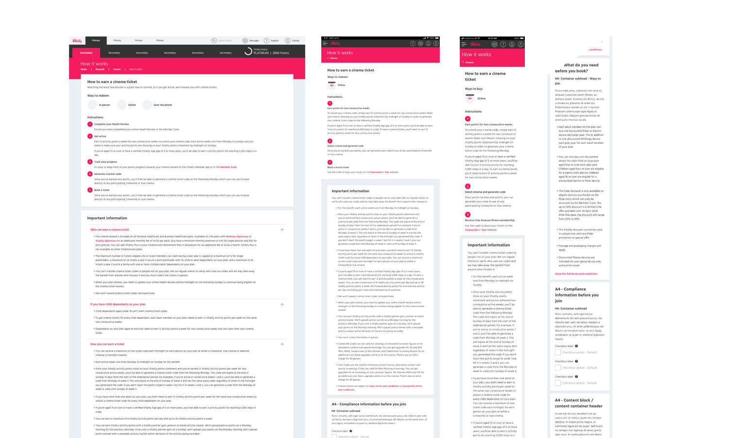
Template 2 - how to
This page is the second page it its series, so when you click on the previous page (template one), this is displayed which gives them more detailed info about this partner before starting the signup journey. Again using components for every eventuality in order to save time in the future but also for consistency.
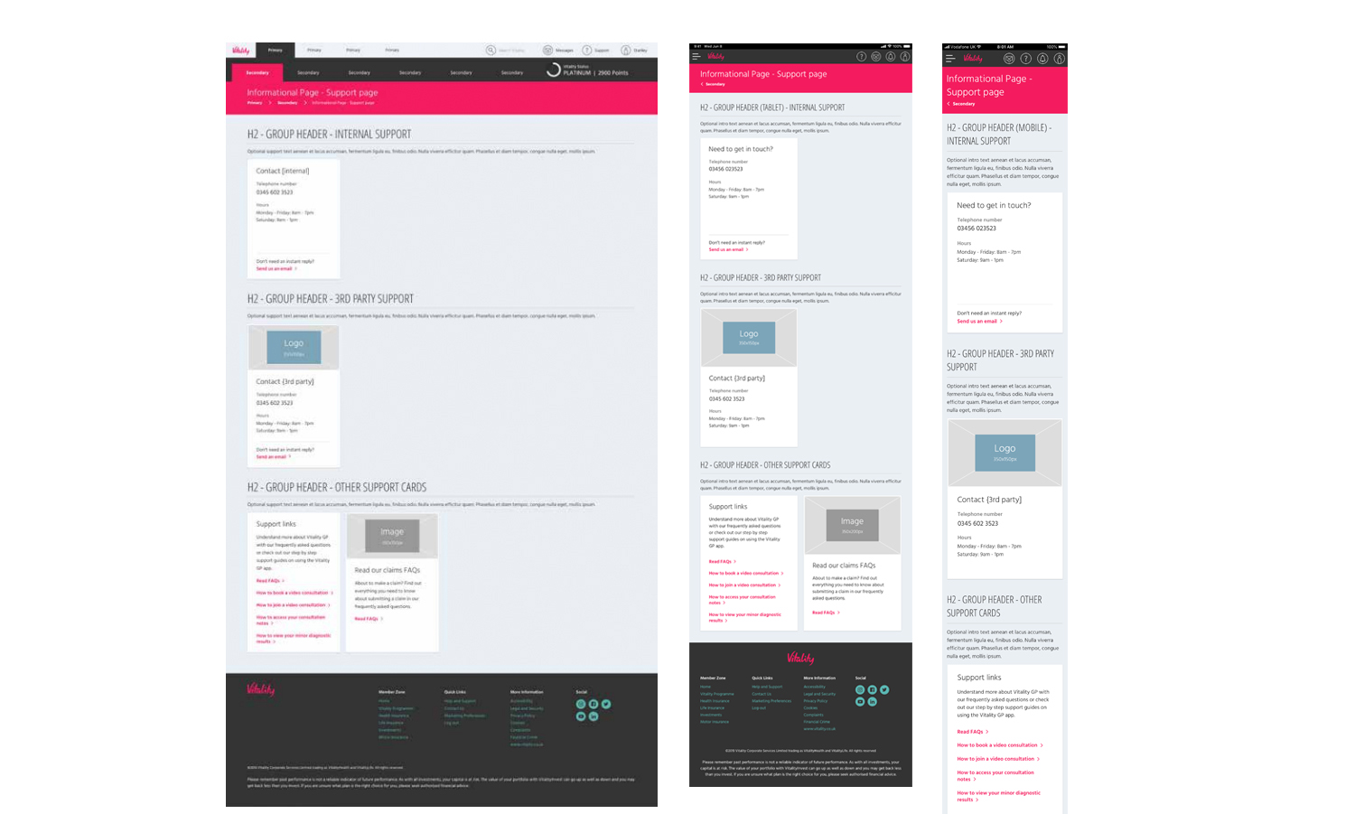
Template 3 - contact details
This is used for contact details, whether that’s a direct phone call, Whatsapp or FAQs, whoever uses this template can provide whichever means of contact for the partner.
Create multiple partner journeys from the templates.
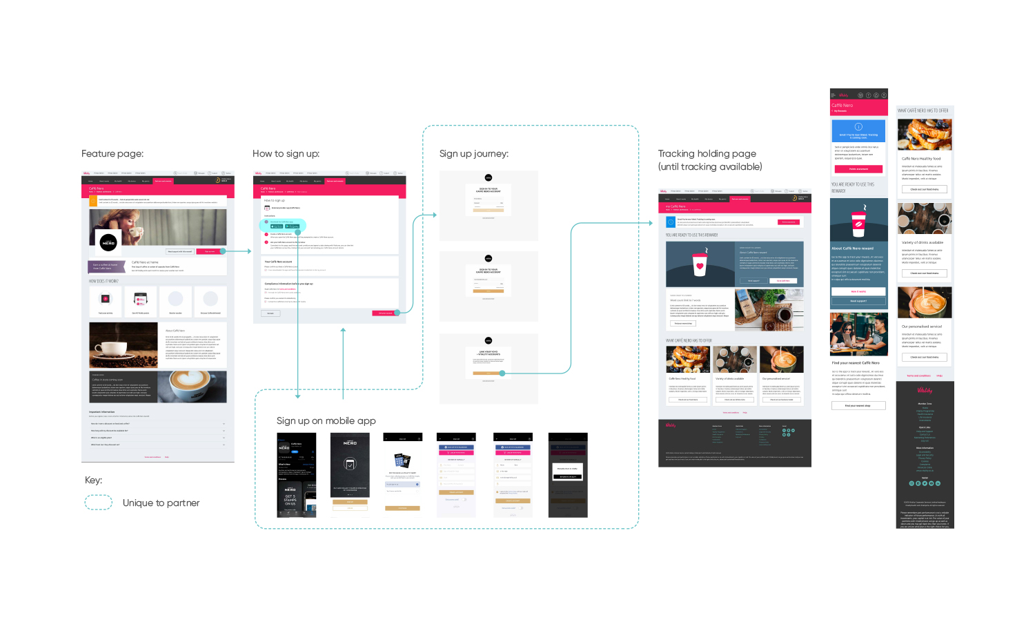
Each partner has slightly different way of joining, whether this is online, in person, over the phone or in an entirely different way such as signing up on the app (Caffè Nero). This just meant that every partner could use the same template for their feature page, how to sign up (which gives clarification unique to the partner) and contact page . The unique part of the journey is the capturing their data through unique partner sign ups.
My role
Using the previously designed templates to create this partner flow. By only changing the middle of the journey the user doesn’t feel like entering an entirely different sign up process. Some of the partners are more challenging than others and is normally determined by the partner integration capabilities. Caffè Nero in particular in a good example.
The challenge
Scenario - client could be on desktop, go to the Caffè Nero partner page to sign up, however we had to direct them to the Caffè Nero app as this is the only way to sign up but then direct them back to vitality, enter their credentials to link their account. This is due to the fact we had to work with the partners system that doesn’t have a website sign up process. The journey is therefore broken and I had to develop a way to keep the user on path.
