Event Insurance Services Design System
Design System
The Brief
Whilst working for the Agency "Adido" - I was assigned the responsibility of developing a design system that could be applied to both the Event Insurance CRM and website. To ensure consistency and efficiency across the numerous features of the CRM, I opted to create the design system using Atomic design principles. This approach allowed me to break down complex components into smaller, reusable elements, ensuring a cohesive and streamlined user experience throughout the platform. By implementing an Atomic design system, I could effectively manage and maintain consistency across all aspects of the CRM's interface.
The design system
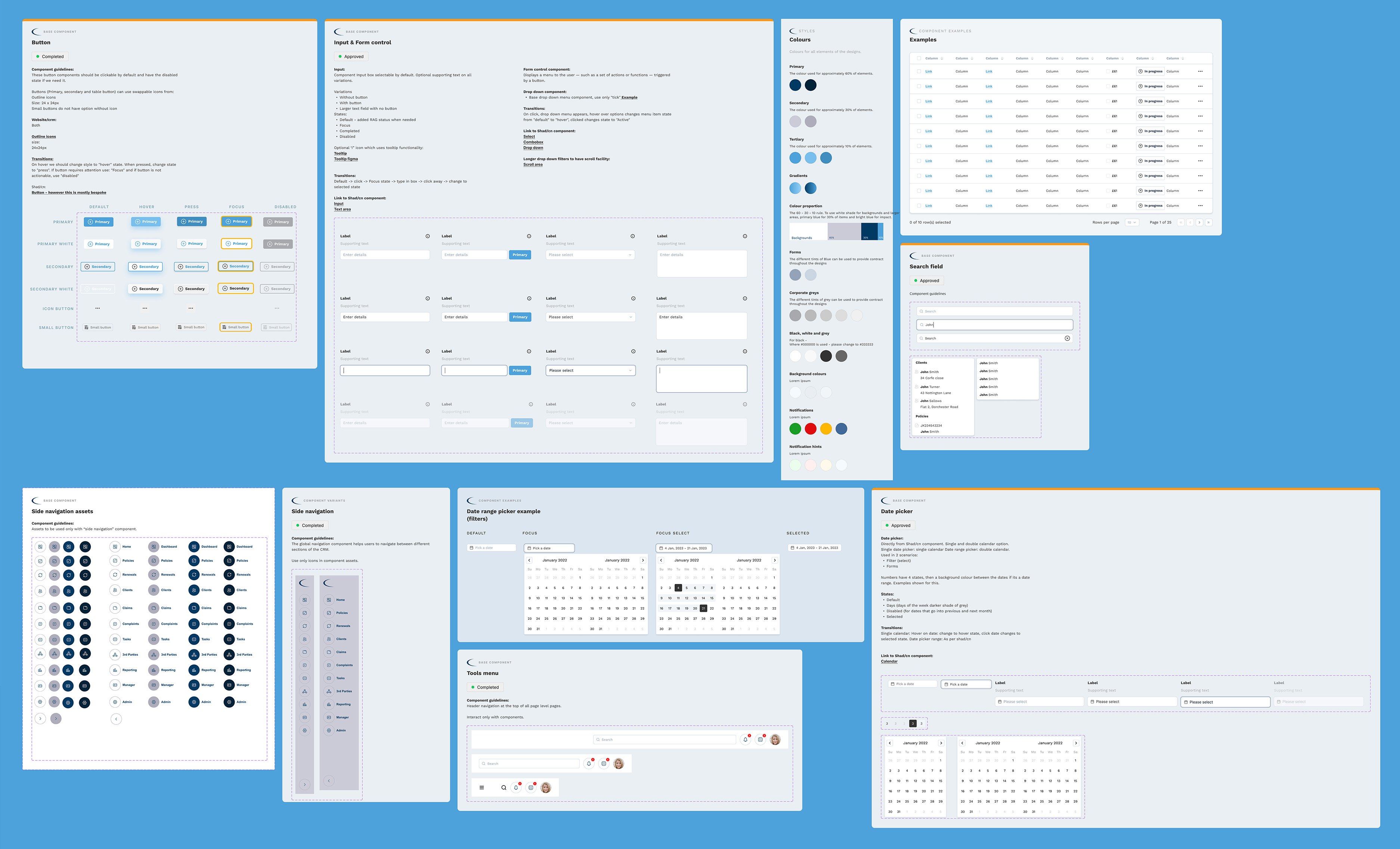
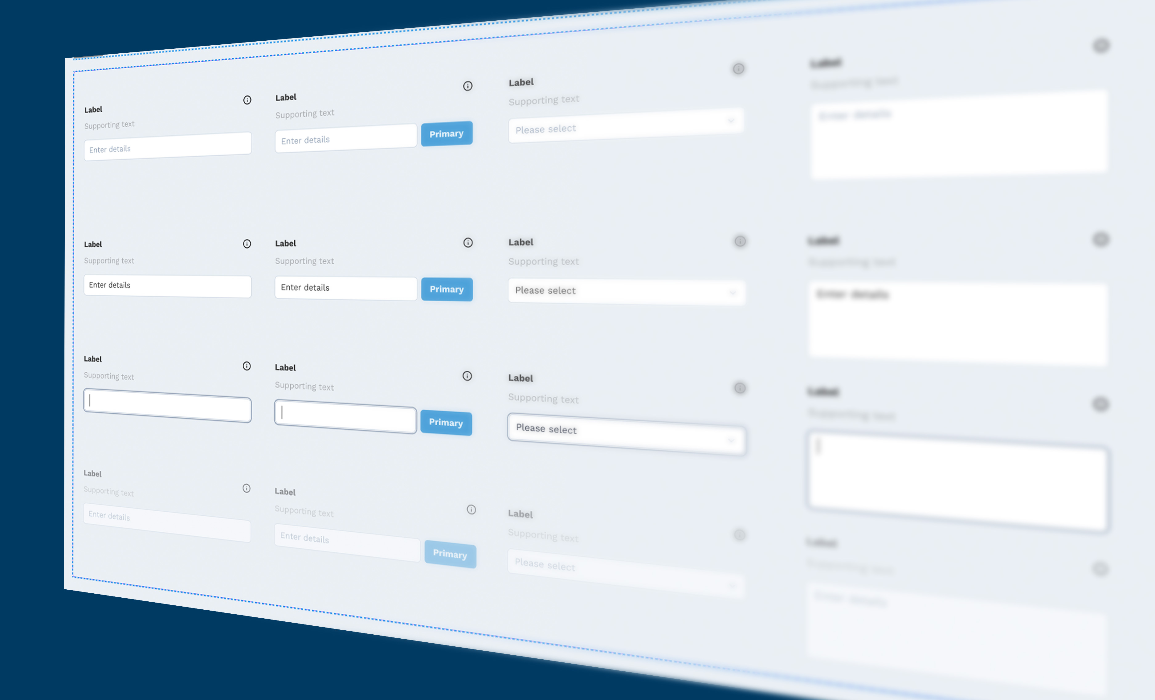
The design system was meticulously crafted from scratch and has now transformed into a robust and flexible framework, offering a diverse array of components for utilisation. This adaptable system provides designers and developers with an extensive toolkit to create cohesive and consistent user interfaces. With its comprehensive collection of components, the design system empowers teams to efficiently build visually appealing and user-friendly experiences across different platforms.
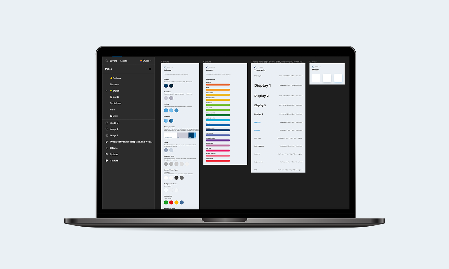
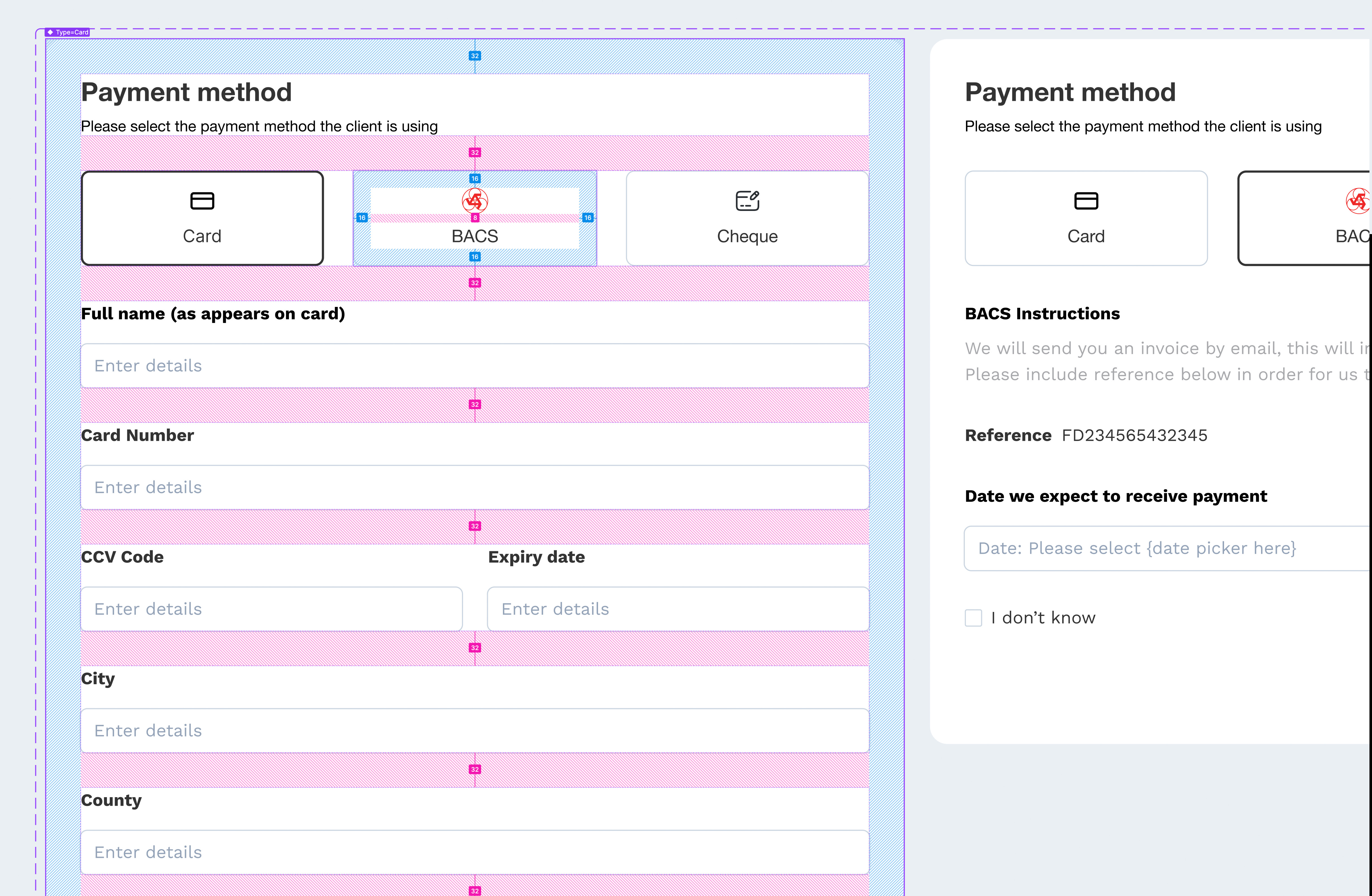
The system was designed in Figma, with its dedicated file serving as a central source for both the CRM UI design and the subsequent EIS website. Following atomic design principles, I organized similar components into groups to minimize redundancy and streamline development efforts. For each component, I provided detailed documentation on its usage and specifications, making it easier for developers to implement and enabling other designers to seamlessly pick up the system in the future. This approach ensured consistency across designs and facilitated efficient collaboration among team members.
Spacing
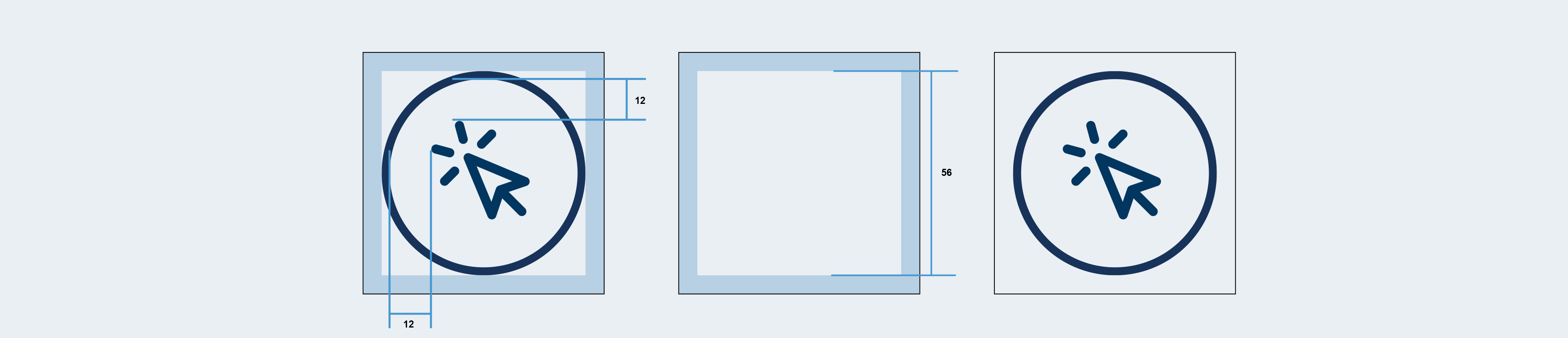
For this project, I implemented the 8px grid system, which greatly facilitated the handover process to developers. This approach ensured that all elements within the design system adhered to multiples of 8px. For instance, spacing between elements could be set at values such as 8px, 16px, or 24px, while font sizes also followed this consistent pattern. By utilizing the 8px grid system throughout the design system, we achieved a harmonious and structured layout that seamlessly translated into development.
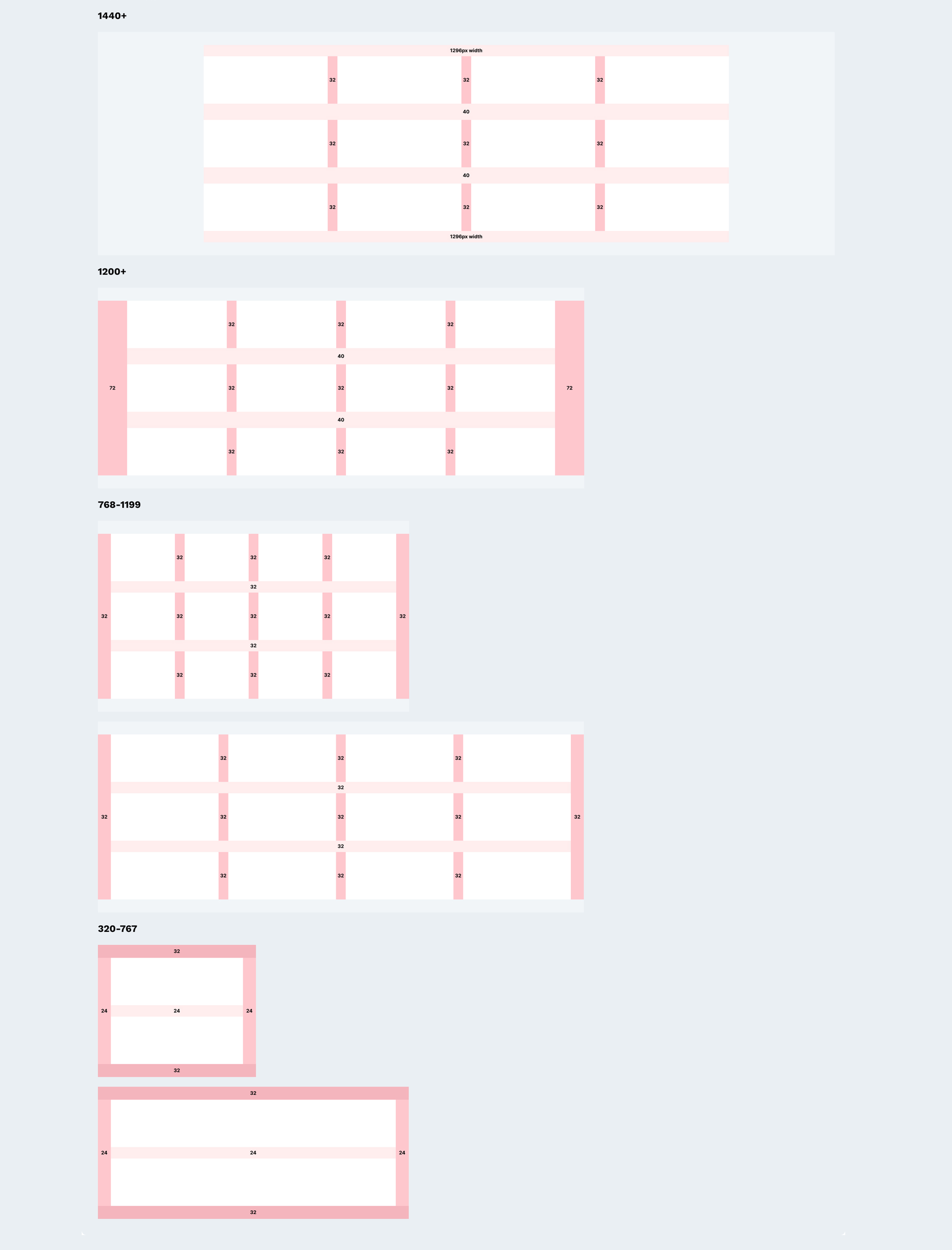
However, specific rules were established for device sizes to ensure optimal responsiveness. The breakpoints were defined as follows: 1440px and above, 1200px to 1439px, 768px to 1199px, and 320px to 767px. For each of these breakpoints, I specified the appropriate spacing between components and margins. This approach allowed for consistent visual alignment and ensured that the design system seamlessly adapted across different screen sizes.
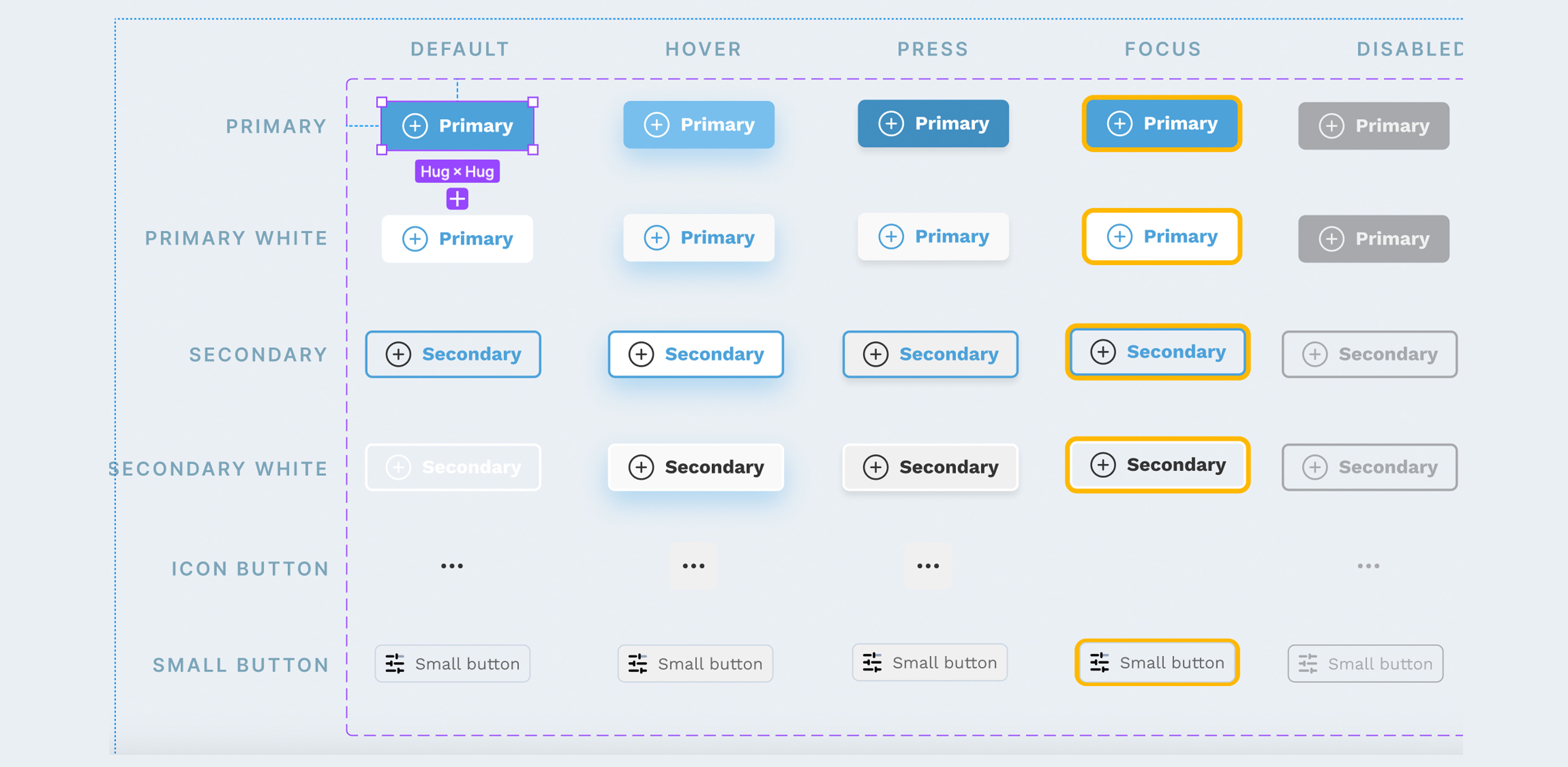
Hurdles
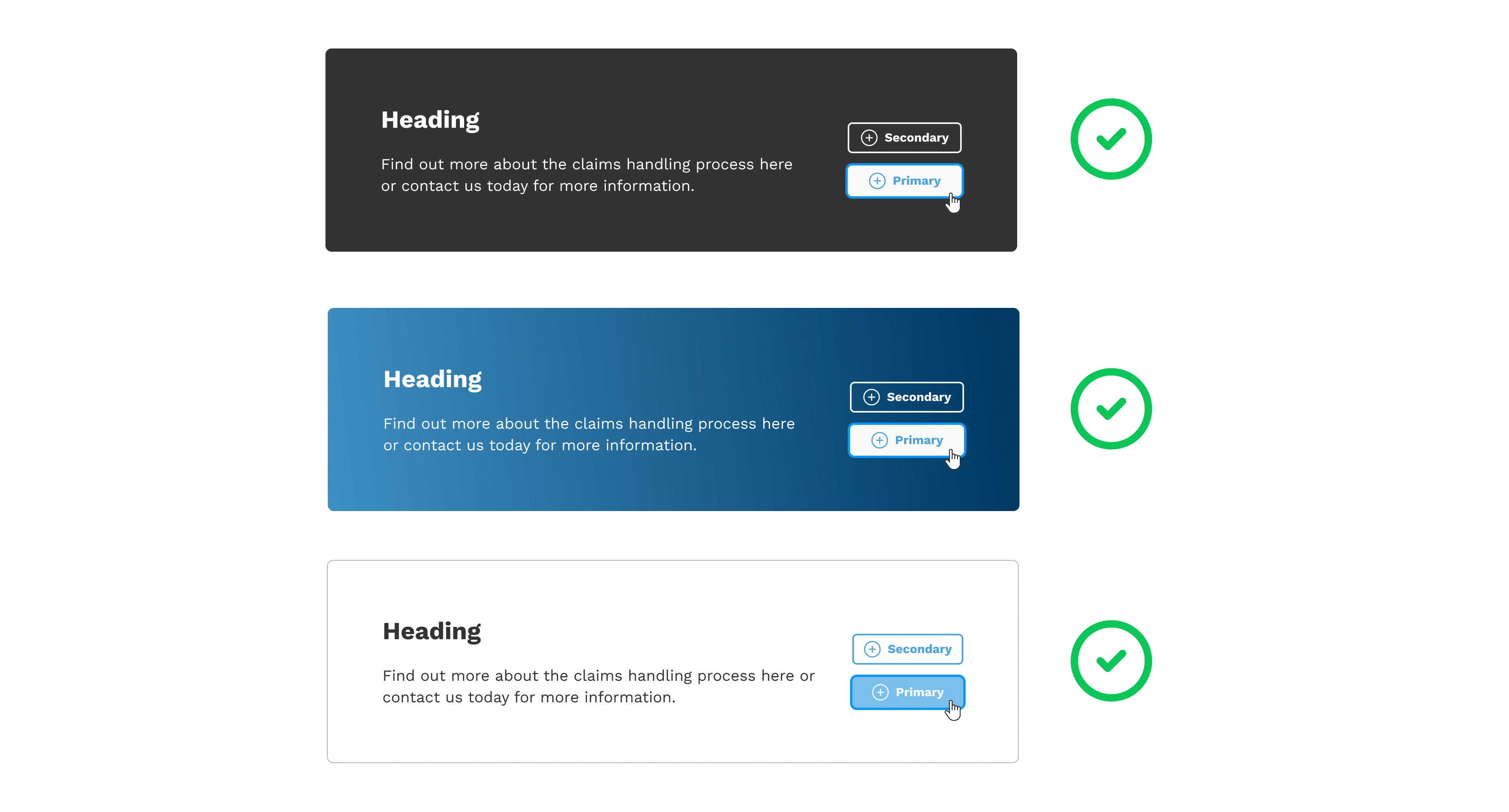
During the build phase, the design system underwent continuous evolution as it can be challenging to anticipate how components will perform once implemented. A notable example of this was observed with buttons. Initially, the "Hover" state of the buttons included a drop shadow effect, which unfortunately became indistinguishable on blue backgrounds due to their similar color. Consequently, I had to reconsider the foundational component and make necessary adjustments. As a best practice, it is always preferable to modify the main component to function effectively on all backgrounds rather than creating additional variations for specific cases. Here is an image showcasing the button set prior to these modifications:
Here is a demonstration of the buttons on the various backgrounds to show why these were not effective:
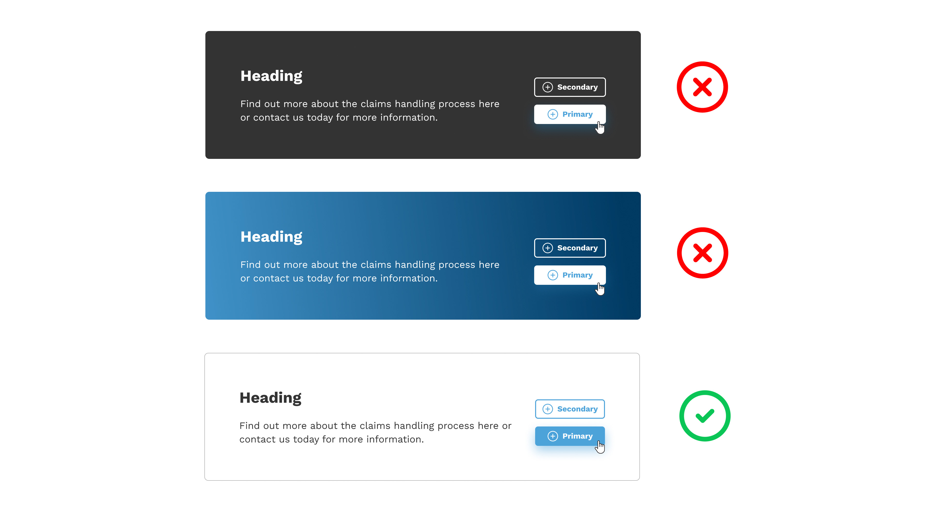
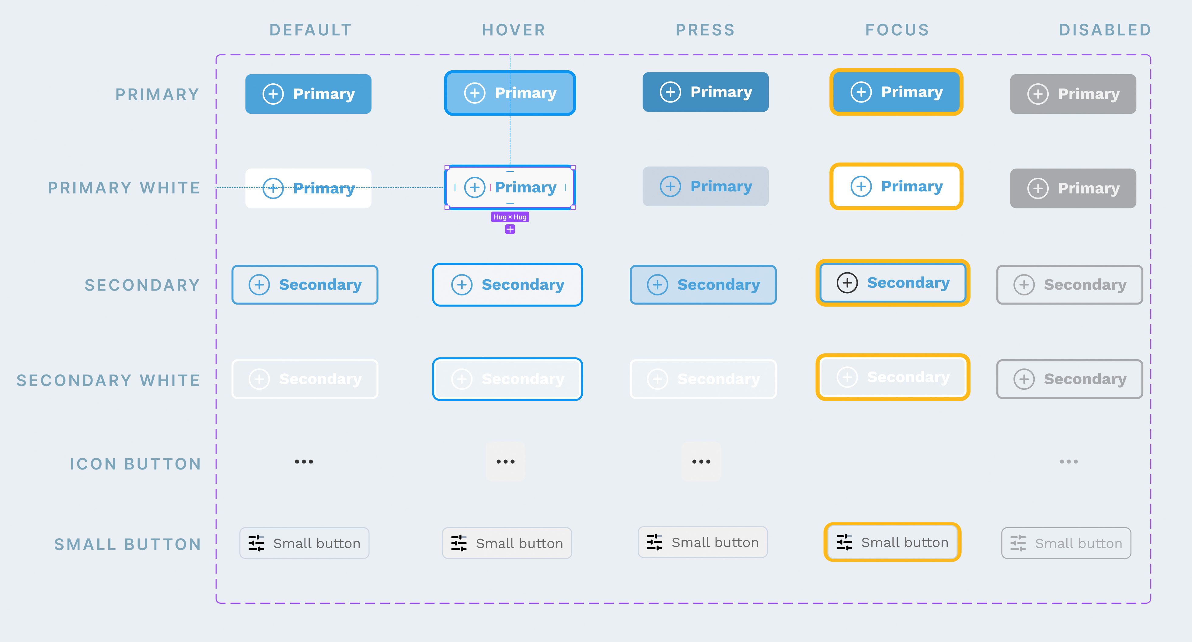
How I improved the buttons
To address this issue, I conducted thorough research to explore how other companies approached similar challenges. It became evident that the prevailing trend was to move away from using drop shadows and instead opt for an outline style. Intrigued by this approach, I decided to implement it and found that it significantly enhanced the visual effectiveness of the buttons. By adopting this alternative design choice, we were able to ensure better visibility and consistency across different background colors, resulting in a more cohesive and visually appealing user experience.