Event Insurance Services Website
UI + UX
The brief
The client briefed the team at Adido on developing a new and improved website that would utilise the same content as their previous site. It was crucial for this new website to seamlessly integrate with the CRM Platform, which I had also designed. While the website and CRM were built differently, we needed them to appear seamless side by side and function as an integrated system. I created some new functionality where I felt there old system needed improving.
The challenges
-
There are lot of policy types, which can cause confusion for customers applying for the incorrect insurance for their event
-
Creating protals was new, Broker portal has various levels (parent,child) to think about
-
Creating a design system which worked for website and the CRM
Creating the user flow
Through collaborative efforts with the SEO team and a project manager, I developed a user flow for the website. While much of the existing website flow remained intact, creating this user flow provided valuable insights into areas that required improvements. By mapping out the user journey, it became evident where changes were needed to enhance usability and optimise the overall experience. This process allowed for a clear understanding of which specific areas required attention and guided subsequent modifications to ensure an improved website flow.
Sitemap
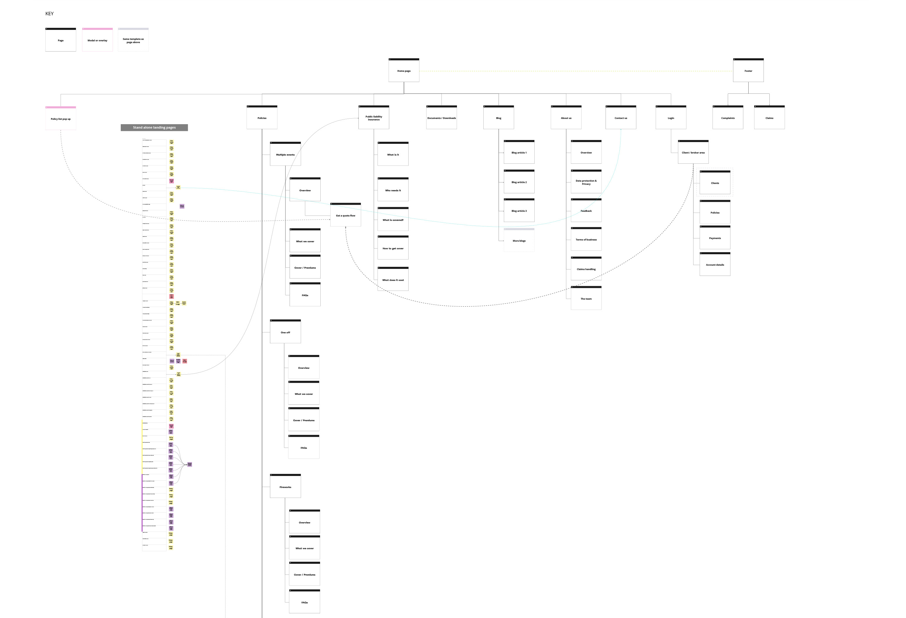
Once the client approved and expressed satisfaction with the finalised user flow, I proceeded to work on creating the sitemap. The user flow served as a valuable reference point, providing a clear structure and guiding framework for developing the sitemap. By leveraging the established user flow, I was able to effectively organise and structure the website's content, ensuring logical navigation and seamless user experience. This process allowed for a smooth transition from conceptualising user journeys to translating them into a well-defined sitemap that formed the backbone of subsequent design and development.
Moodboard
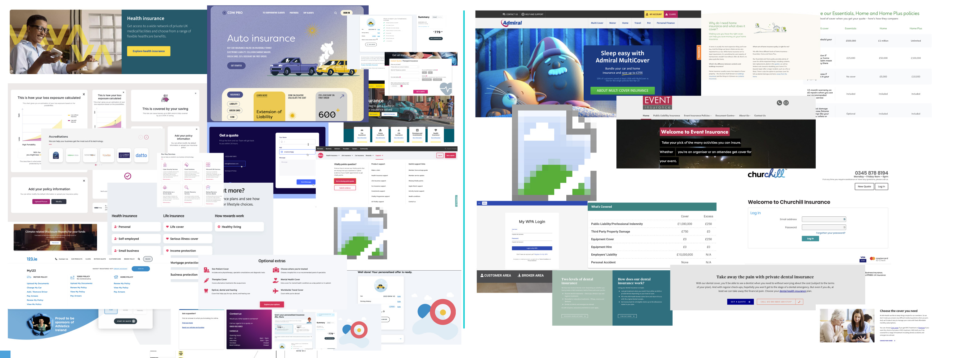
To determine the desired design direction, I curated a moodboard showcasing two distinct styles and presented it to the client. This exercise allowed me to gauge their preferences and understand the direction they wanted to pursue. Ultimately, the client chose the left-hand side of the moodboard, which embodied a relaxed and modern aesthetic rather than a corporate one. Fortunately, I had the privilege of working with a flexible client who encouraged creativity, granting me the freedom to unleash my full creative potential in crafting an exceptional design that aligned with their chosen style.
Wireframes
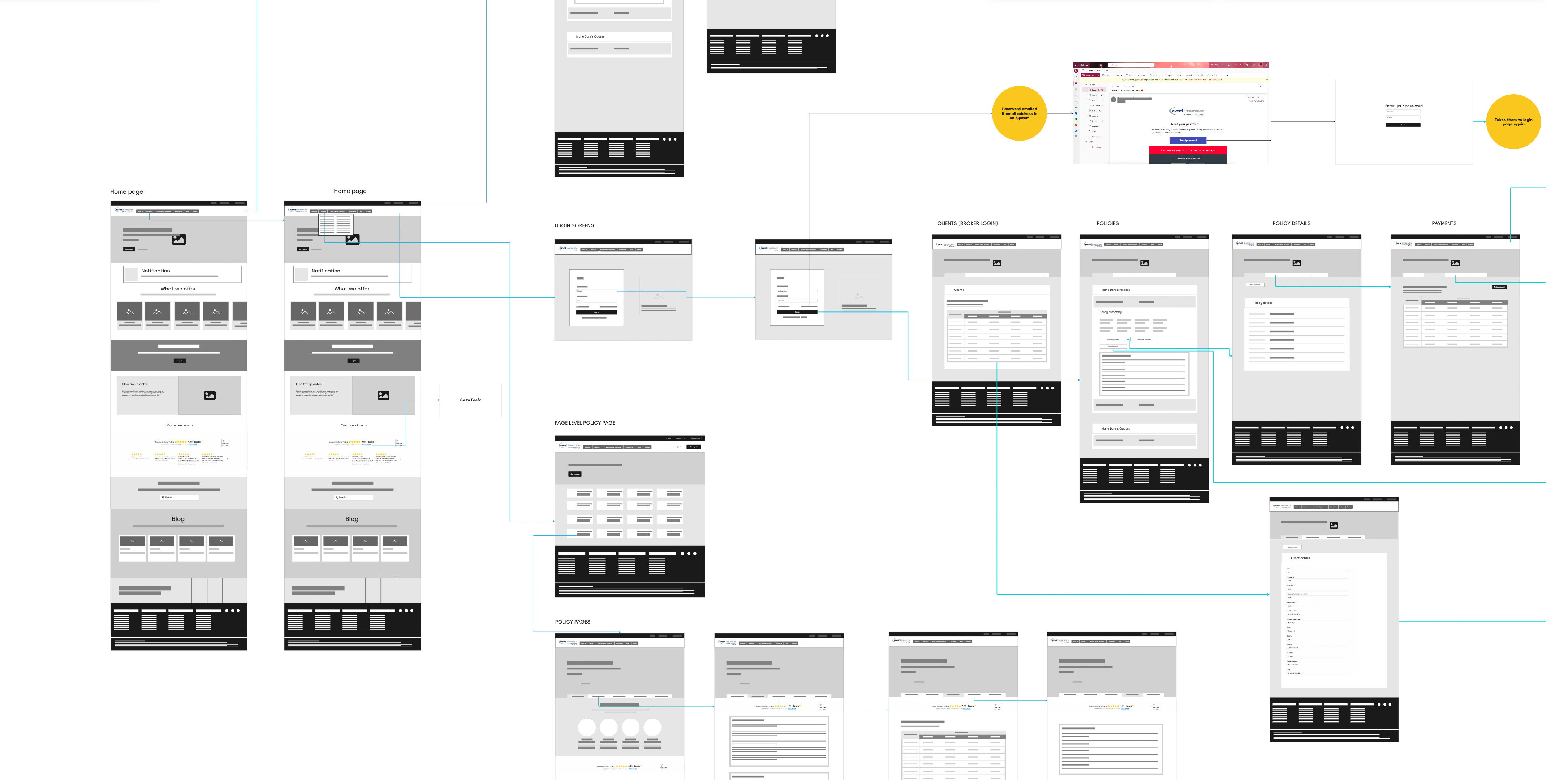
Given the tight deadline for this project, I made the decision to create basic wireframes using Miro. This approach allowed for a more efficient and streamlined workflow, enabling me to quickly visualize and iterate on the design concepts. By opting for basic wireframes in Miro, we were able to save valuable time while still effectively communicating the layout and structure of the project. This decision proved beneficial in meeting our deadline without compromising on the quality of the design deliverables.
Final designs
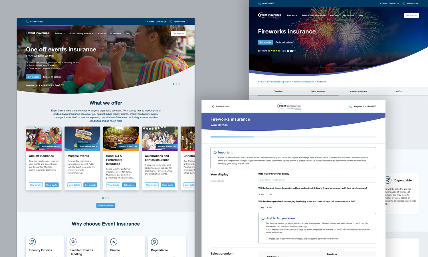
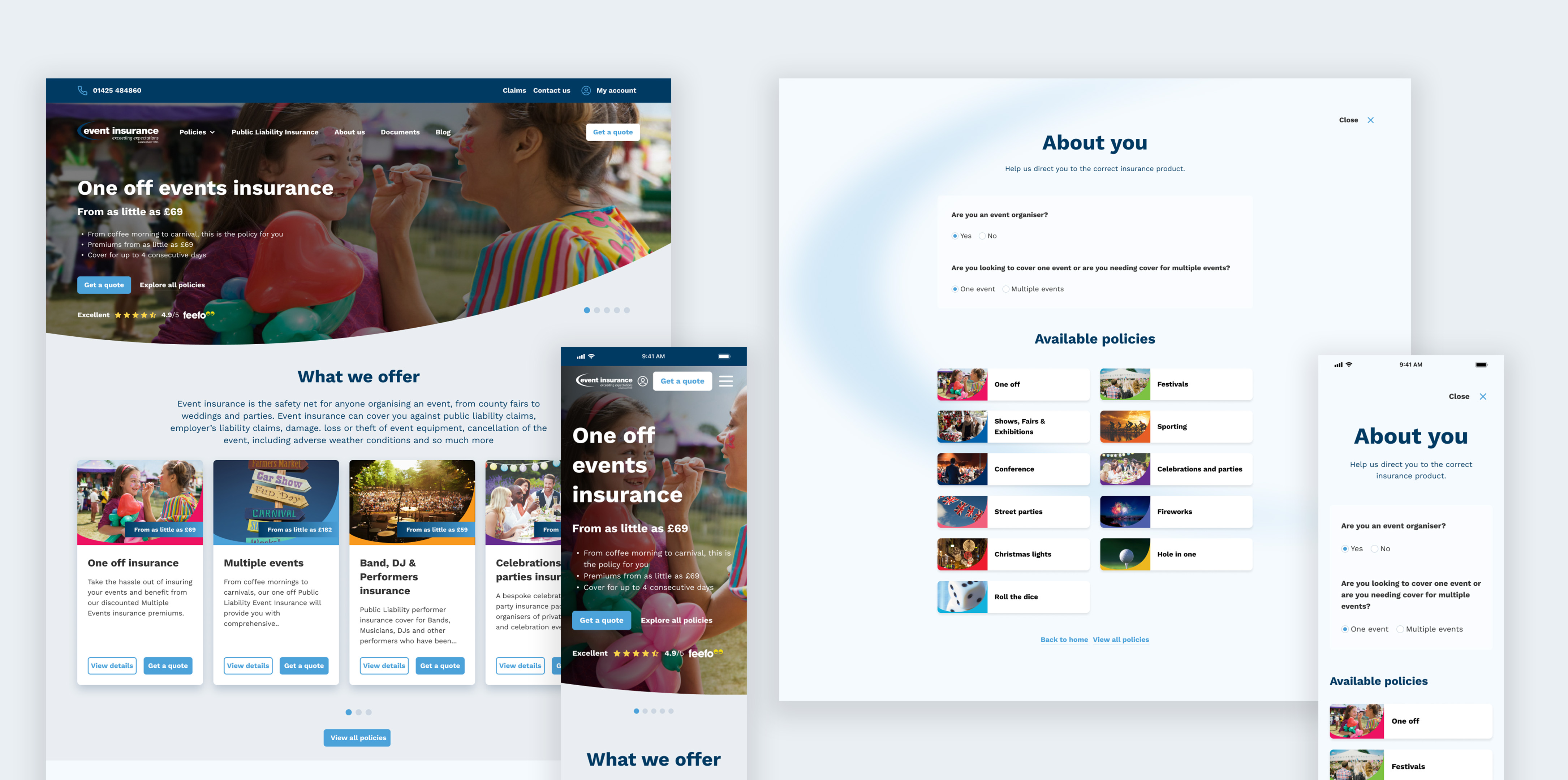
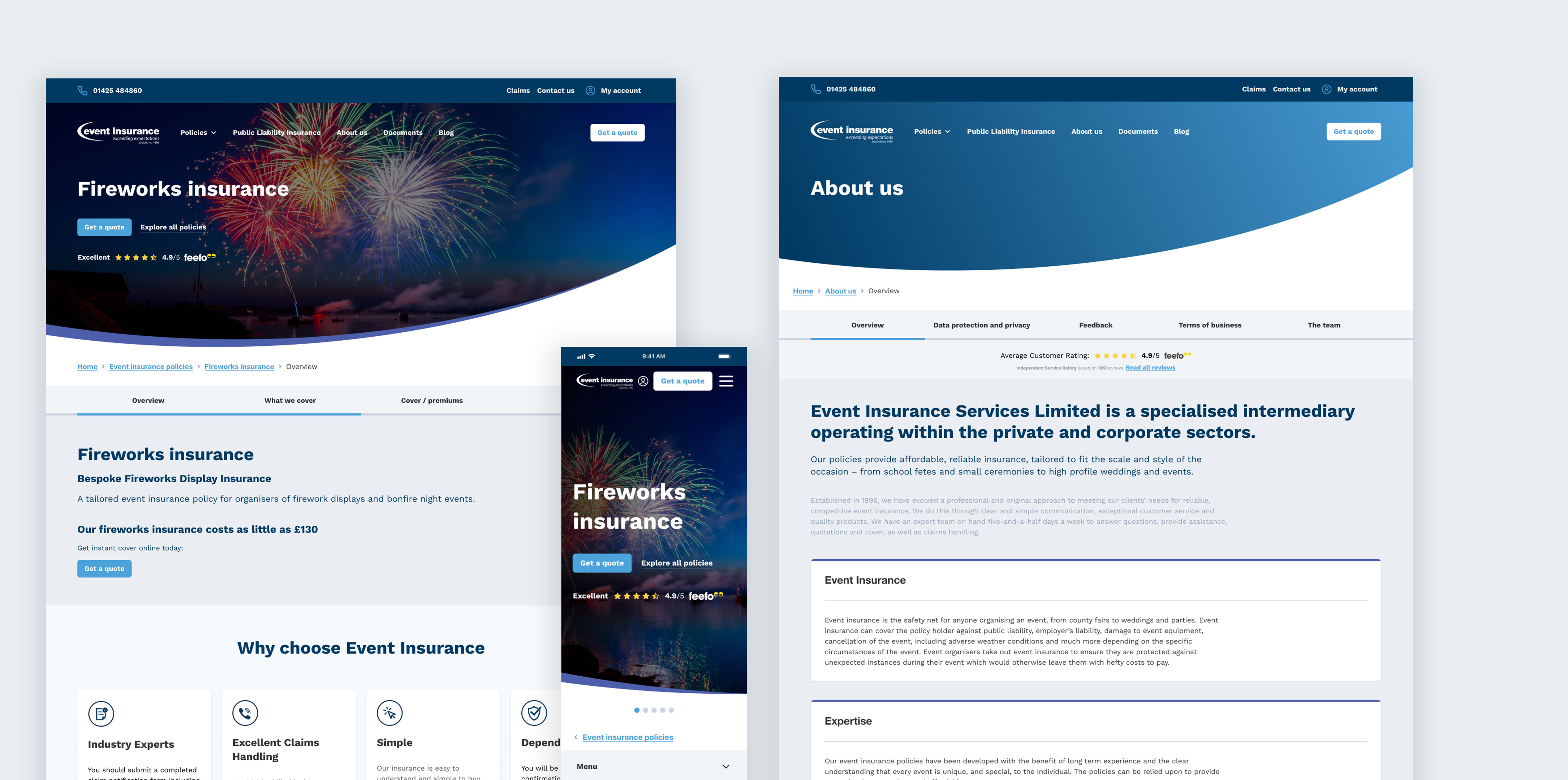
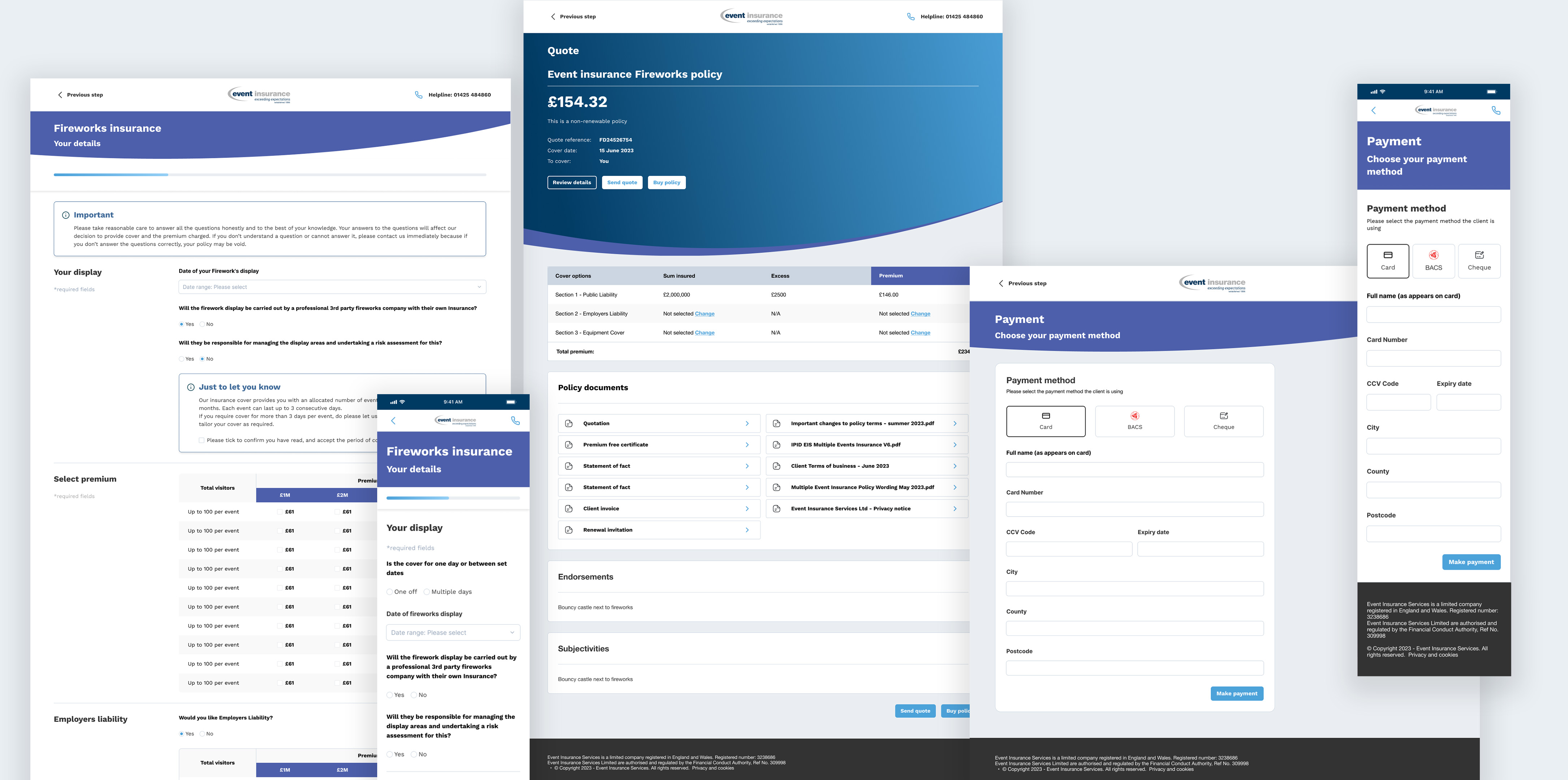
After completing the Miro wireframes, I began working on the design phase. I simultaneously designed the individual pages while expanding and refining the existing design system. This approach mirrored the process used for the CRM platform, ensuring consistency and efficiency across both projects. Additionally, I utilised any pre-existing components from the CRM platform to maintain a cohesive visual style throughout. By adopting this approach, I achieved seamless integration between newly designed pages and existing components while enhancing overall design coherence and efficiency.
