Event Insurance Services CRM
Strong UX focus
Event Insurance Services CRM
Event Insurance is a company that specialises in providing insurance coverage for a wide range of events. They offer 16 different types of policies to cater to the specific needs of each event. In order to enhance their efficiency and streamline their daily operations, they recognised the need for a comprehensive Customer Relationship Management (CRM) system. This involved enhancing their existing architecture to accommodate additional functionalities and implementing a complete user interface overhaul.
The challenges
Event Insurance faces the challenge of managing thousands of policies that are not associated with specific clients. This lack of linkage makes it difficult to track which policies each client has obtained and also prevents clients from accessing their documentation through a login system.
-
Many processes and departments
-
Event Insurance encountered difficulties with their existing CRM data, as it lacked logical coherence. Migrating this data and aligning it with the newly designed system proved to be a challenging task, as it was not easy to match up with the design I had created.
-
Creating wireframes for the whole system ended up with around 300 screens to manage!
-
Marrying the CRM up with the website project
The aim
Create a platform that:
-
Includes a client database and in future link a policy to a client
-
Create a client portal so clients can access their own policies and make changes online
-
Improve online experience so less phone calls coming in
-
Create a broker portal so that parent brokers and child brokers can log in and manage their clients and policies
-
Improve the quote process form
-
Faster load (previous took ages to load and had navigation items that didn’t work)
-
To work with the new website I was designing alongside this, so the architecture had to fit together but also the design system
-
Create a design system that worked from their brand guidelines using shad/cn as framework for these components.
My role
At Adido I was responsible for undertaking the user experience design and interface for this project, which included creating a design system that was implemented across both the CRM and website. While I had the brand guidelines as a foundation, I had the opportunity to enhance them further through this project. Throughout the process, I collaborated closely with the Adido team and worked in close partnership with Dan, Michael, Lucy, and Paul from Event Insurance Services.
Starting at the beginning
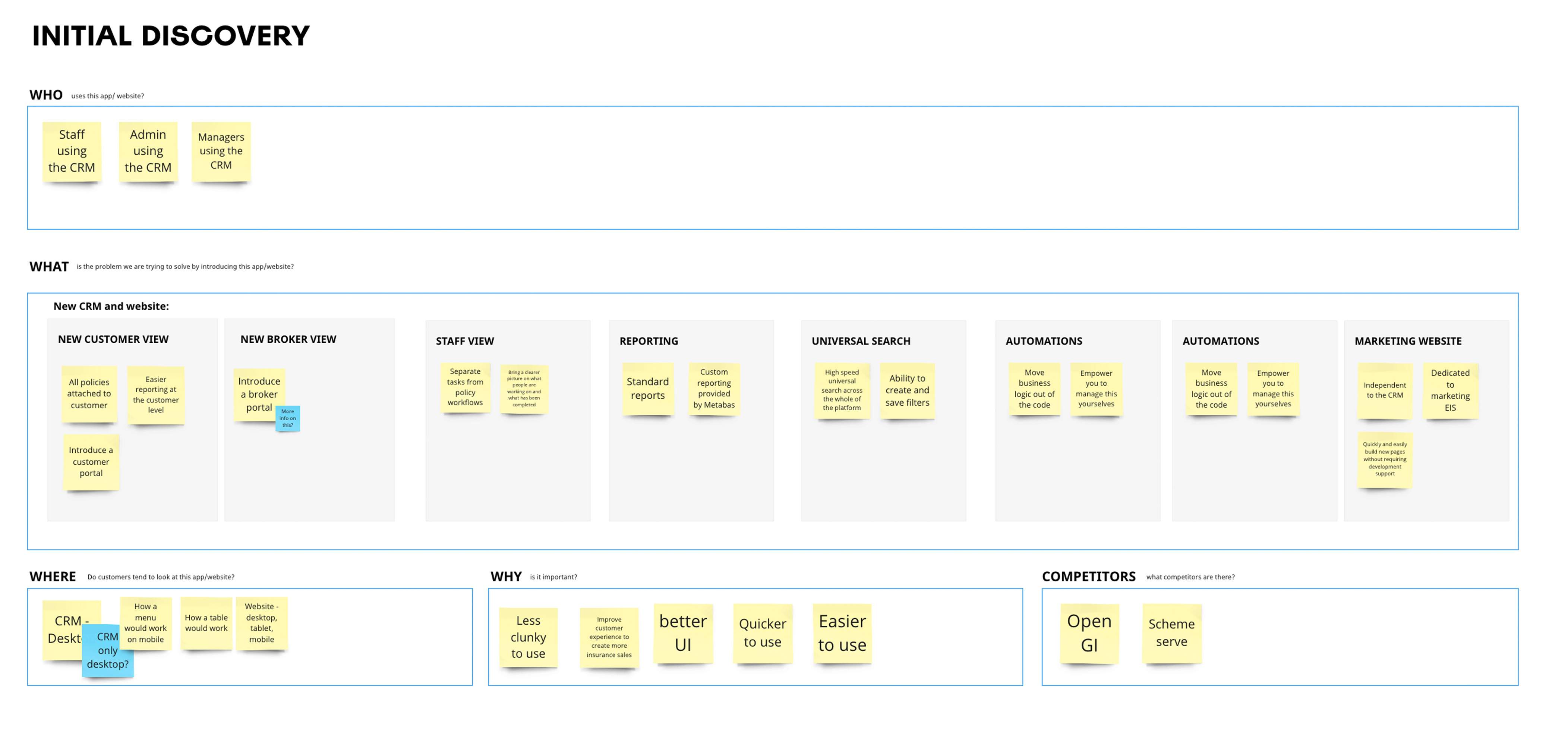
To establish the groundwork, I conducted initial discovery work. This involved examining the existing CRM system and identifying areas that required improvement. I also delved into understanding the intended users of the CRM, including their various levels of logins, as well as conducting competitor analysis to gain insights into industry standards and best practices.
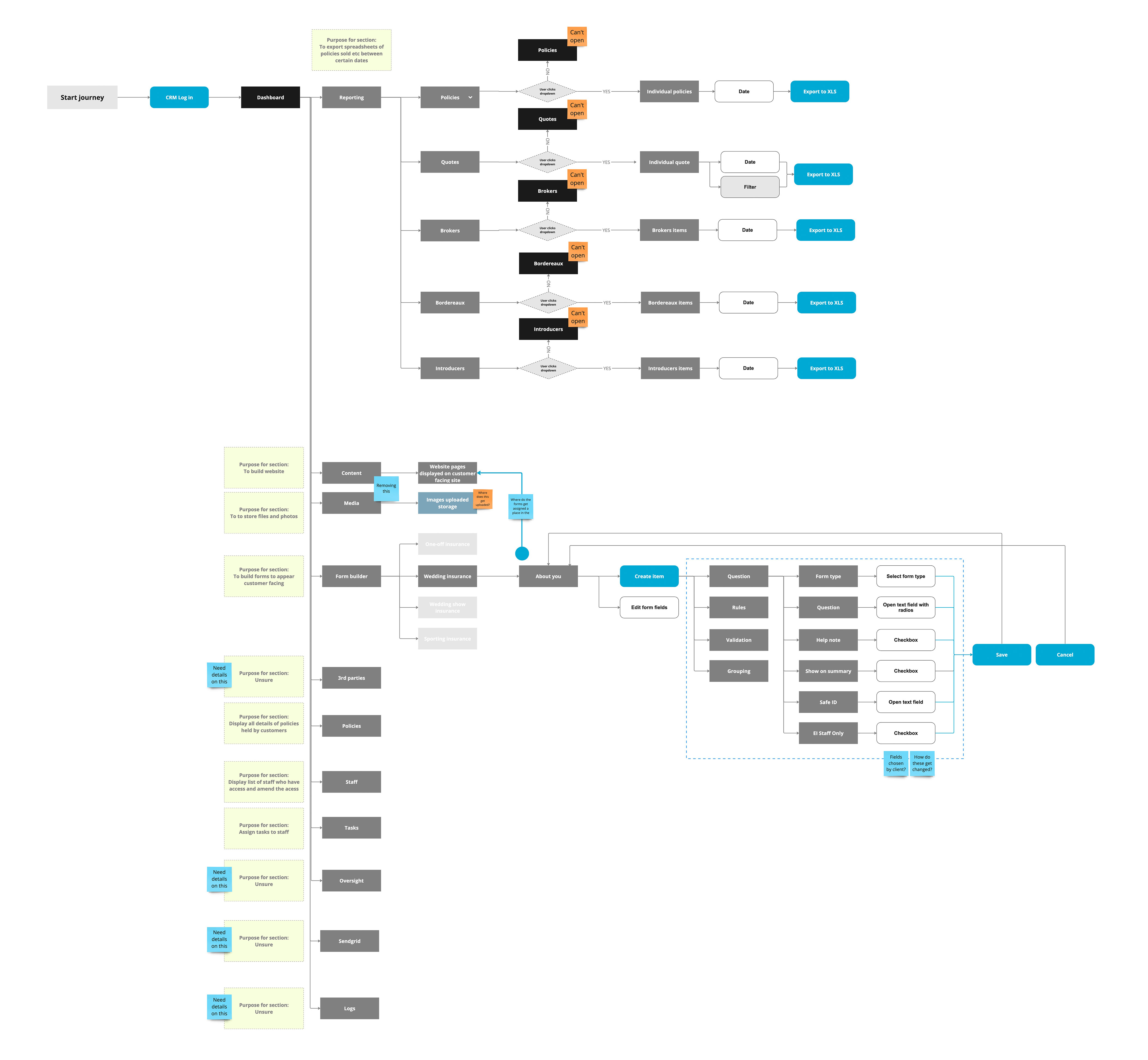
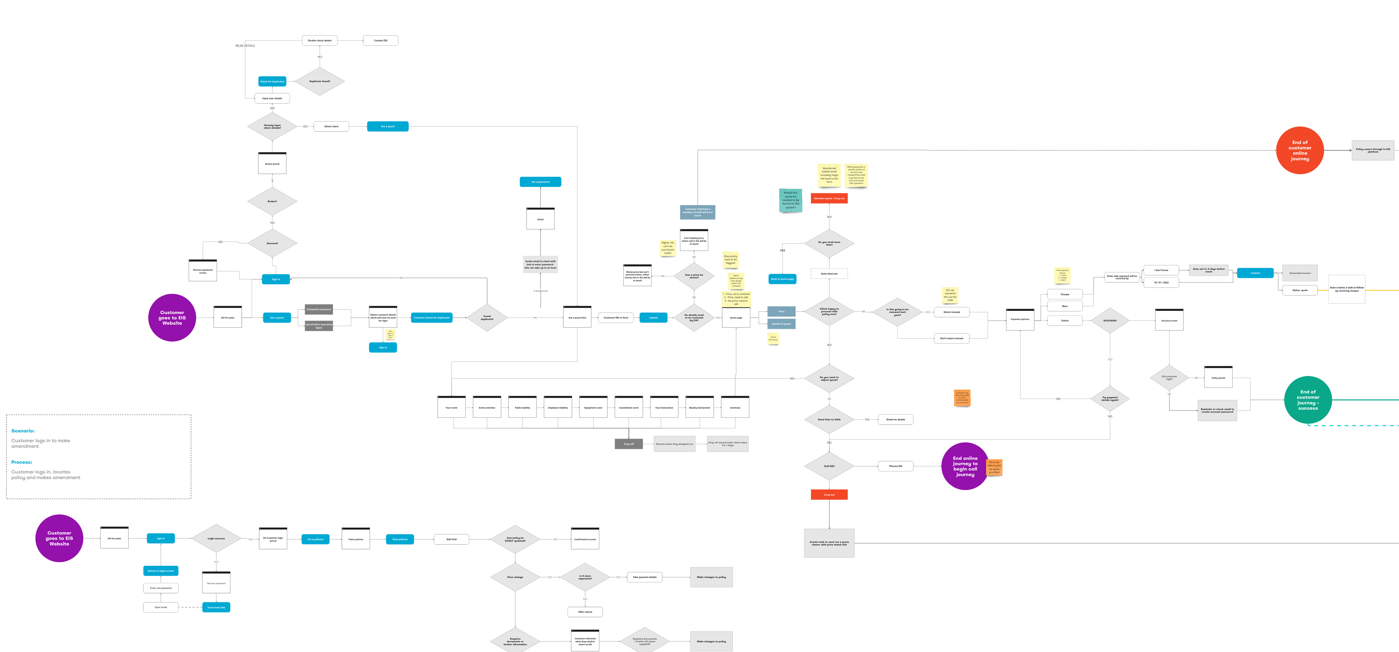
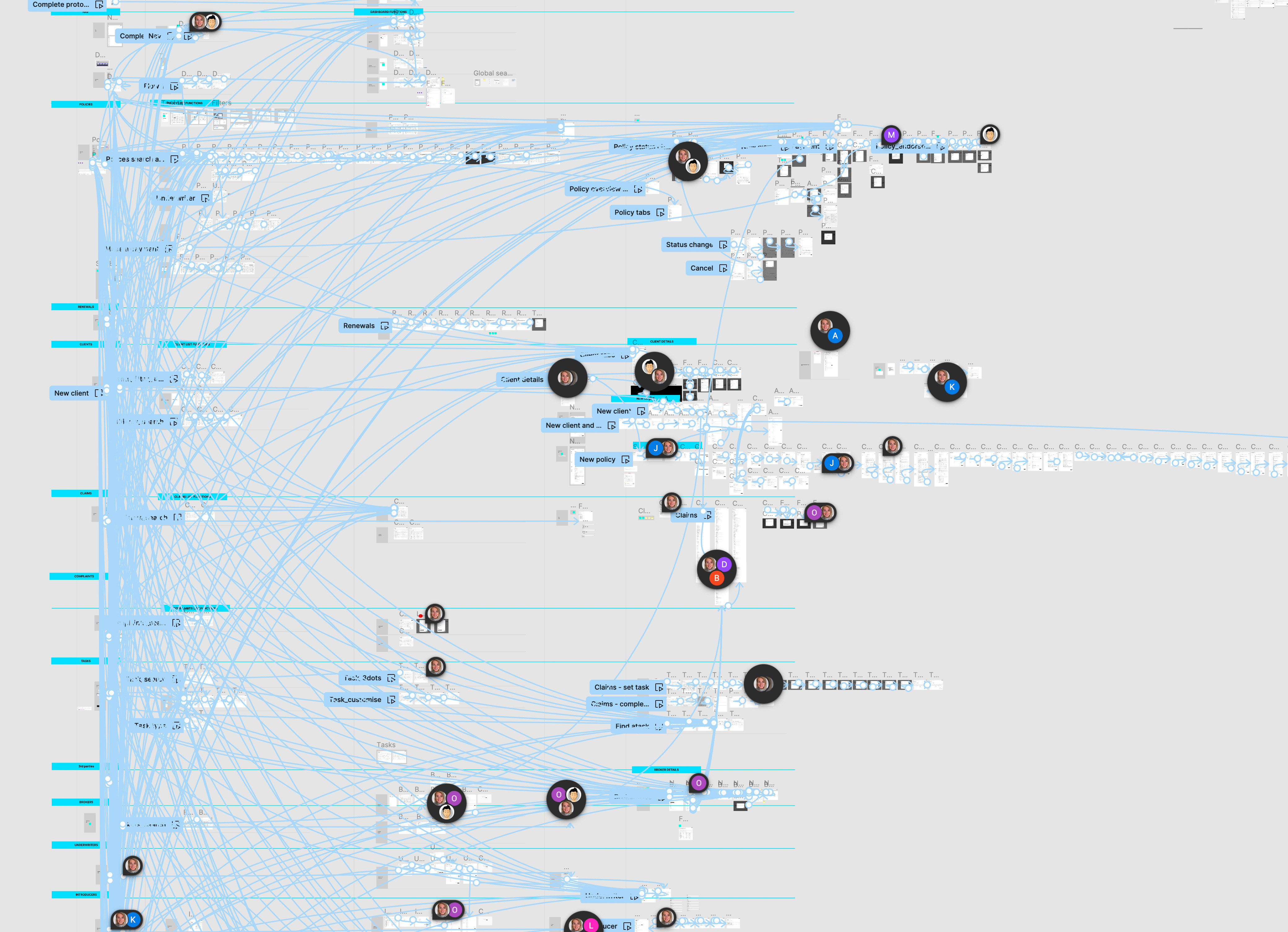
Existing user flow
To identify the existing flaws in the UX, I meticulously mapped out the user flow of the company's current CRM system. This exercise provided me with a comprehensive understanding of all the functionalities that needed to be incorporated into the platform. I then aligned this information with user stories to ensure a seamless integration between user needs and system capabilities.
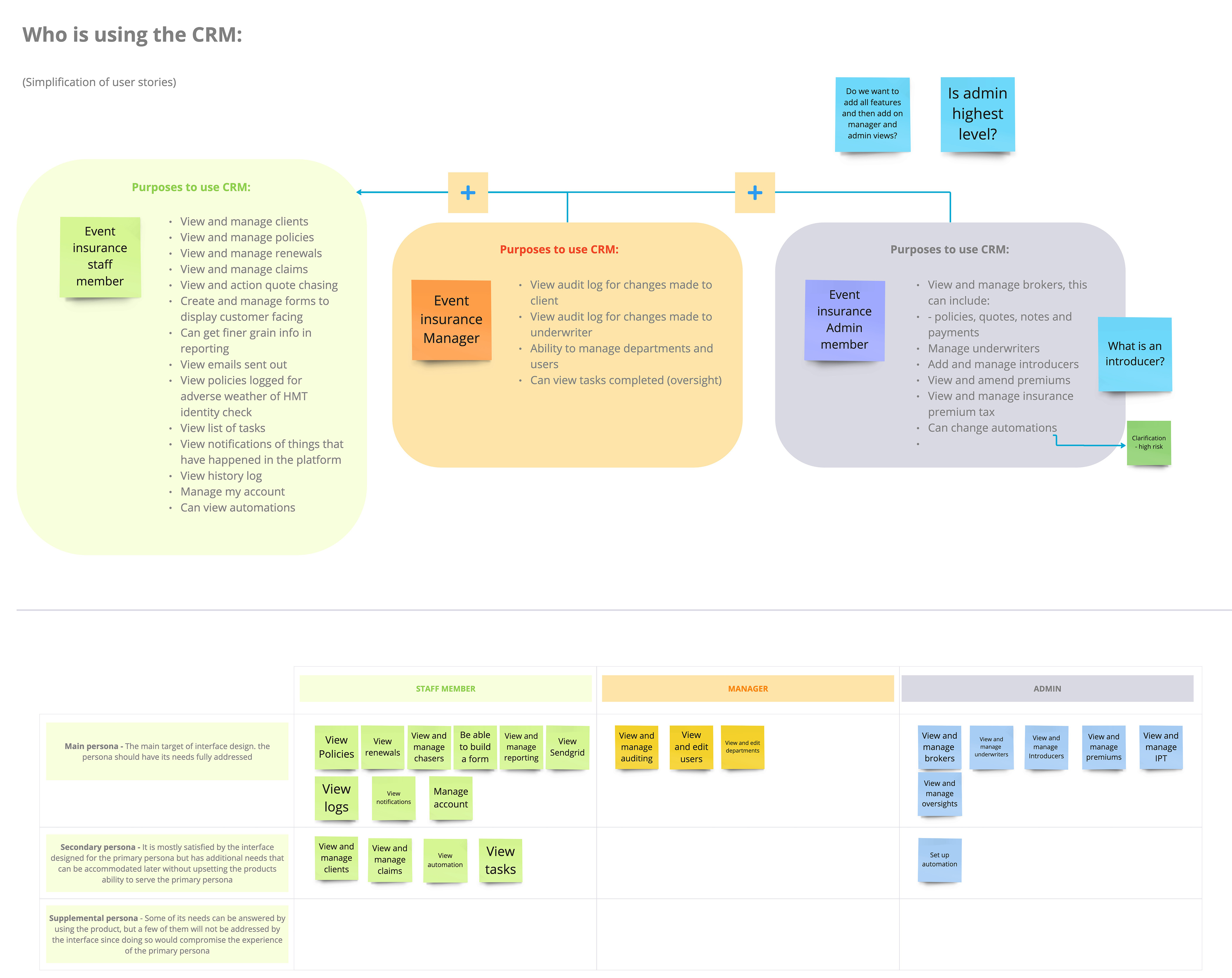
Who is using the platform?
I facilitated a workshop to brainstorm and identify the various user personas and levels of access needed for the platform. This collaborative session proved instrumental in understanding which features were most frequently used and required immediate visibility. Additionally, we explored how the platform should interact with users through notifications and task management, ensuring a seamless user experience.
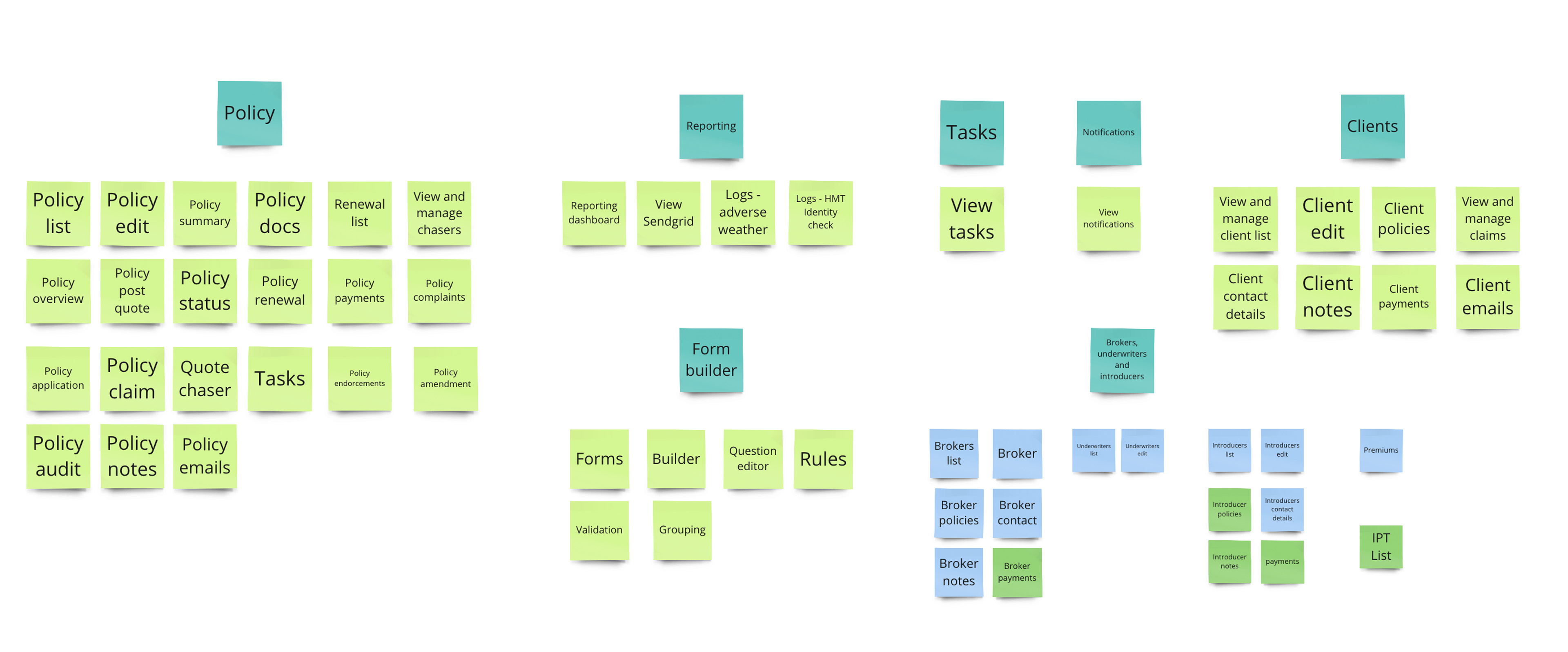
Card sorting
During the card sorting workshop, we systematically organized and categorized the different levels of user login, determined the required navigation items, and structured the content accordingly. This collaborative exercise enabled us to create a well-organised platform that offers intuitive navigation and ensures that users can easily access relevant information based on their specific login level.
Personas
This led me to come up with 3 personas for this platform to cater for.

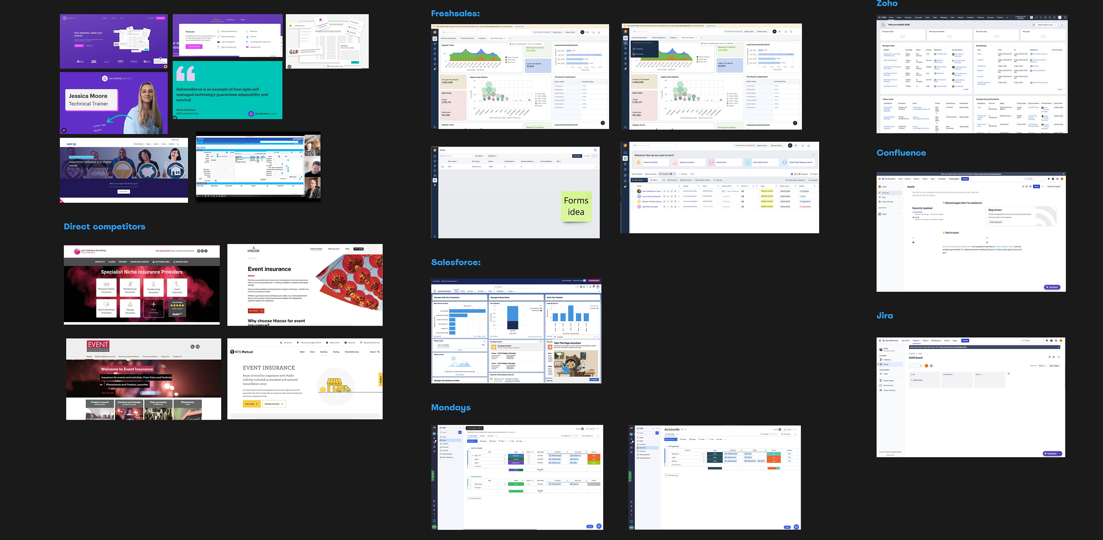
Design benchmark and competitor analysis
I dedicated time to thoroughly explore different CRM platforms by signing up for free trials and conducting extensive testing. This hands-on approach provided me with valuable insights into how CRM platforms function and helped me assess whether certain features would be suitable for this specific case. While some platforms offered useful functionalities, others proved to be overly complex and did not align well with the desired process.
User flow
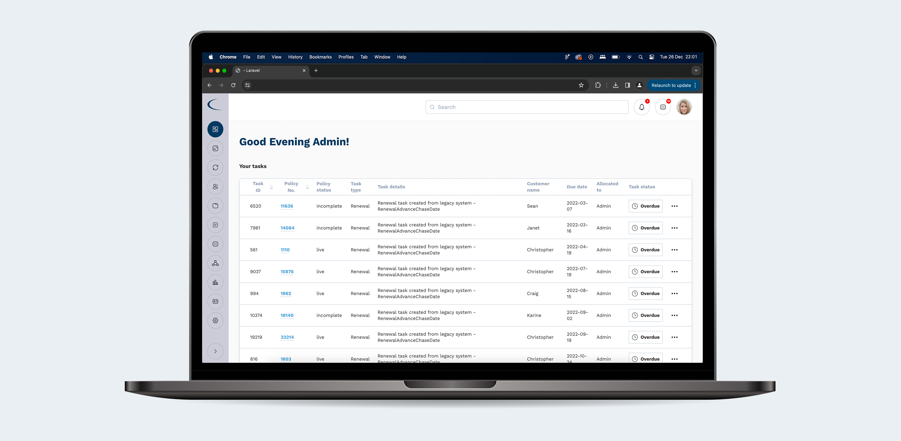
The user flow for this project was highly intricate, requiring a meticulous level of detail. Starting with the highest level of access, "Admin," allowed me to gain a comprehensive overview of all functionalities and information within the system. To effectively design the user flow, I put myself in the users' shoes and conducted research to determine their daily access needs, other areas they frequently accessed, as well as areas that might be less frequently utilized. My initial focus was on understanding how Event Insurance accesses and manages their policies. Let's now delve into the initial stages of the user flow...
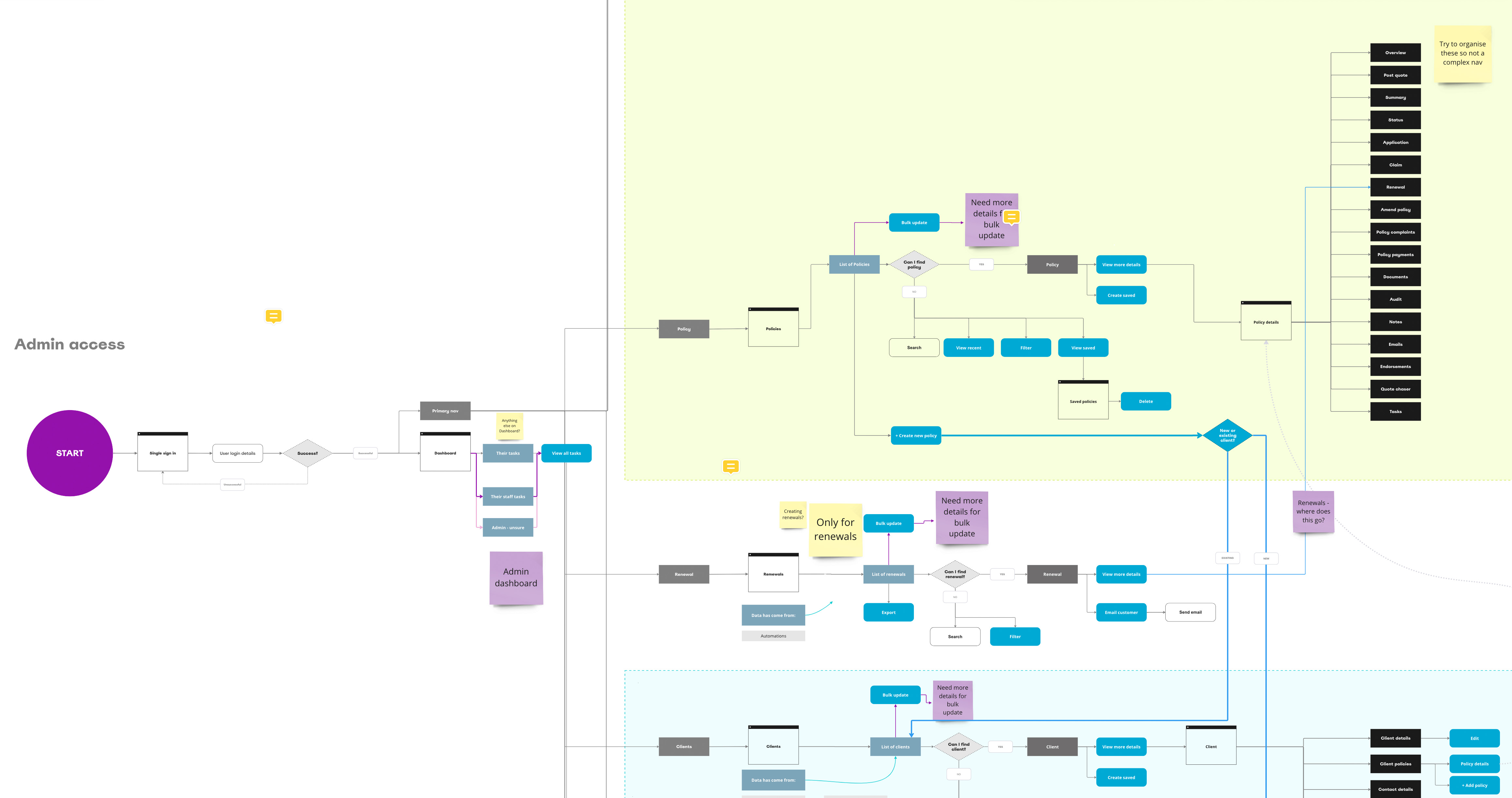
When I finished....
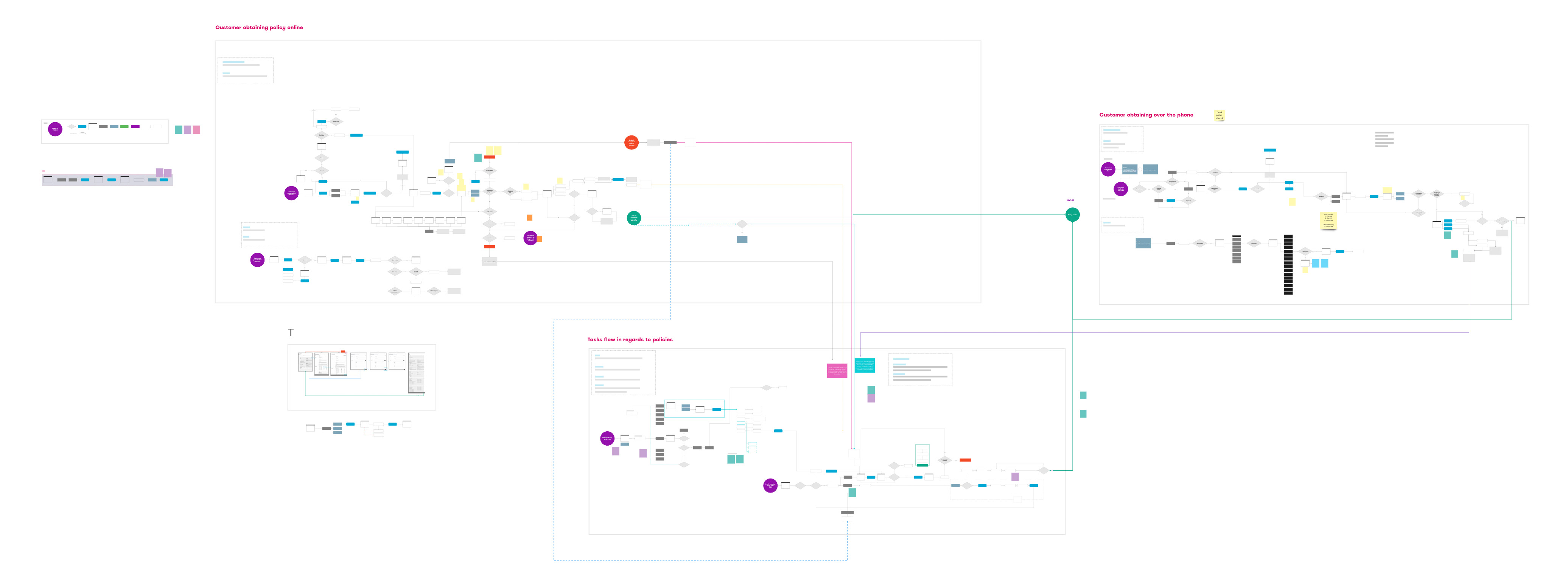
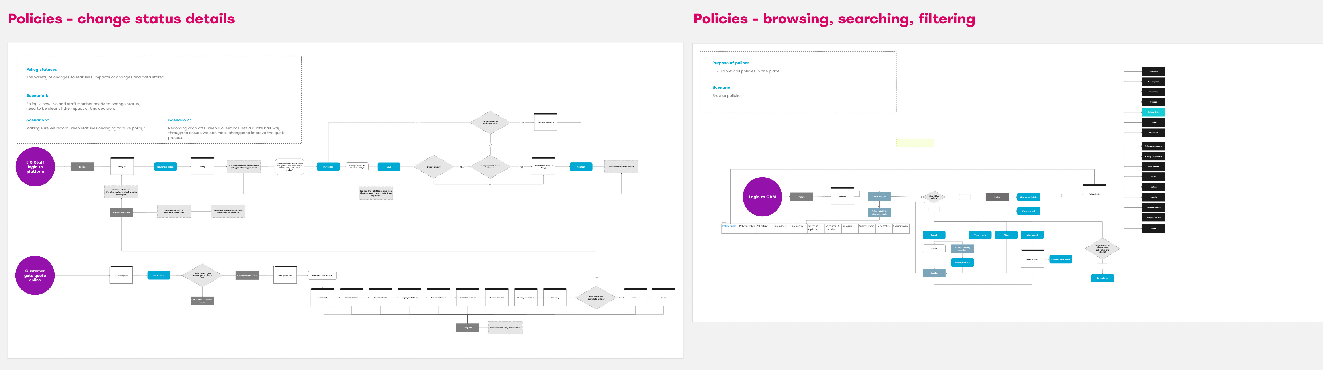
At this stage, I decided to focus on each area of the platform separately, while still considering their interconnectedness. By isolating these areas and examining them individually, I was able to gain a deeper understanding of their specific features and functionalities. This approach allowed me to analyse how each area contributes to the overall user experience while keeping in mind how they all work together as a cohesive whole.
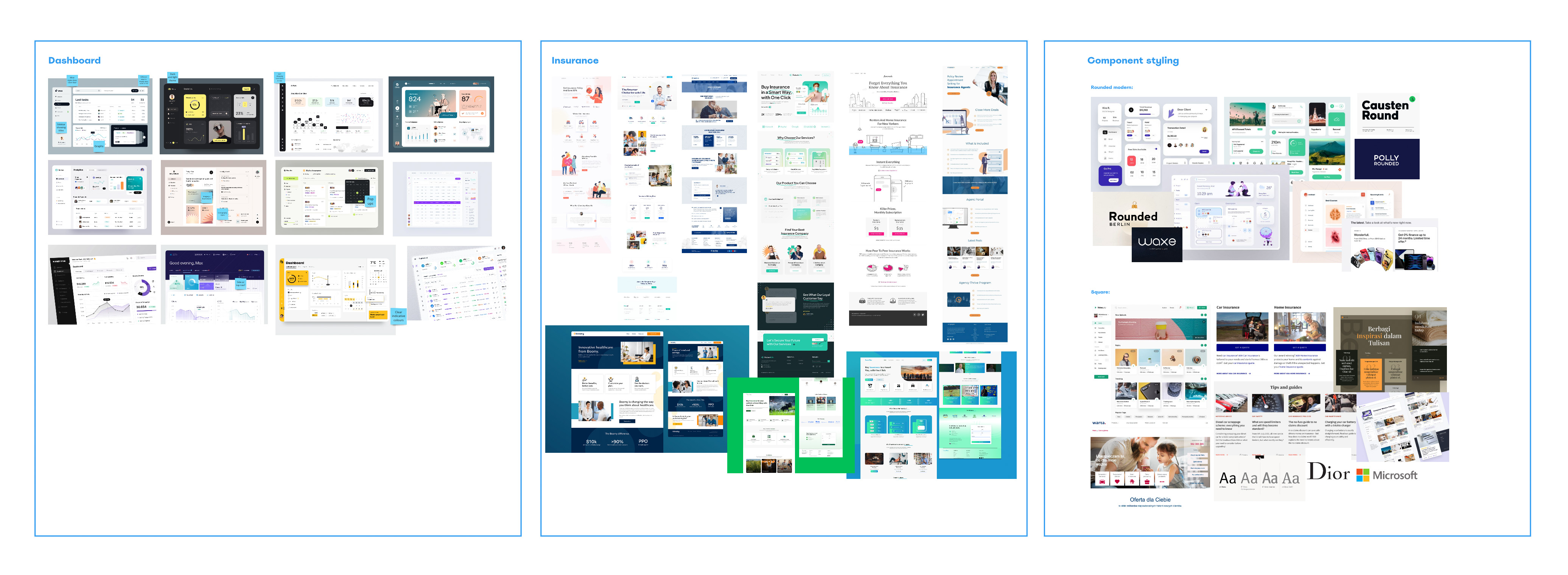
Moodboard
To gain clarity on the client's preferred style direction, I curated moodboards that showcased various visual aesthetics. This process played a pivotal role in understanding the specific styles and design elements that resonated with the client. Whether it was rounded corners for a modern and friendly look or a more corporate aesthetic for a professional appearance, these moodboards served as valuable references to align our design choices with the client's vision.
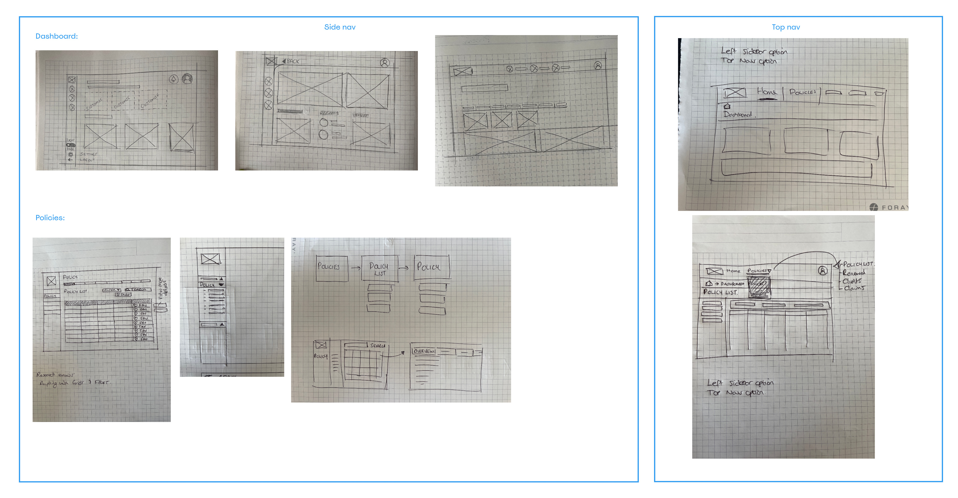
Sketches
To stimulate creativity and generate ideas, I took a hands-on approach by putting pen to paper. By sketching rough layouts, I was able to explore different possibilities and concepts that would inform the wireframing process. This exercise allowed me to visualise and refine the overall structure and arrangement of elements, paving the way for more effective wireframe development.
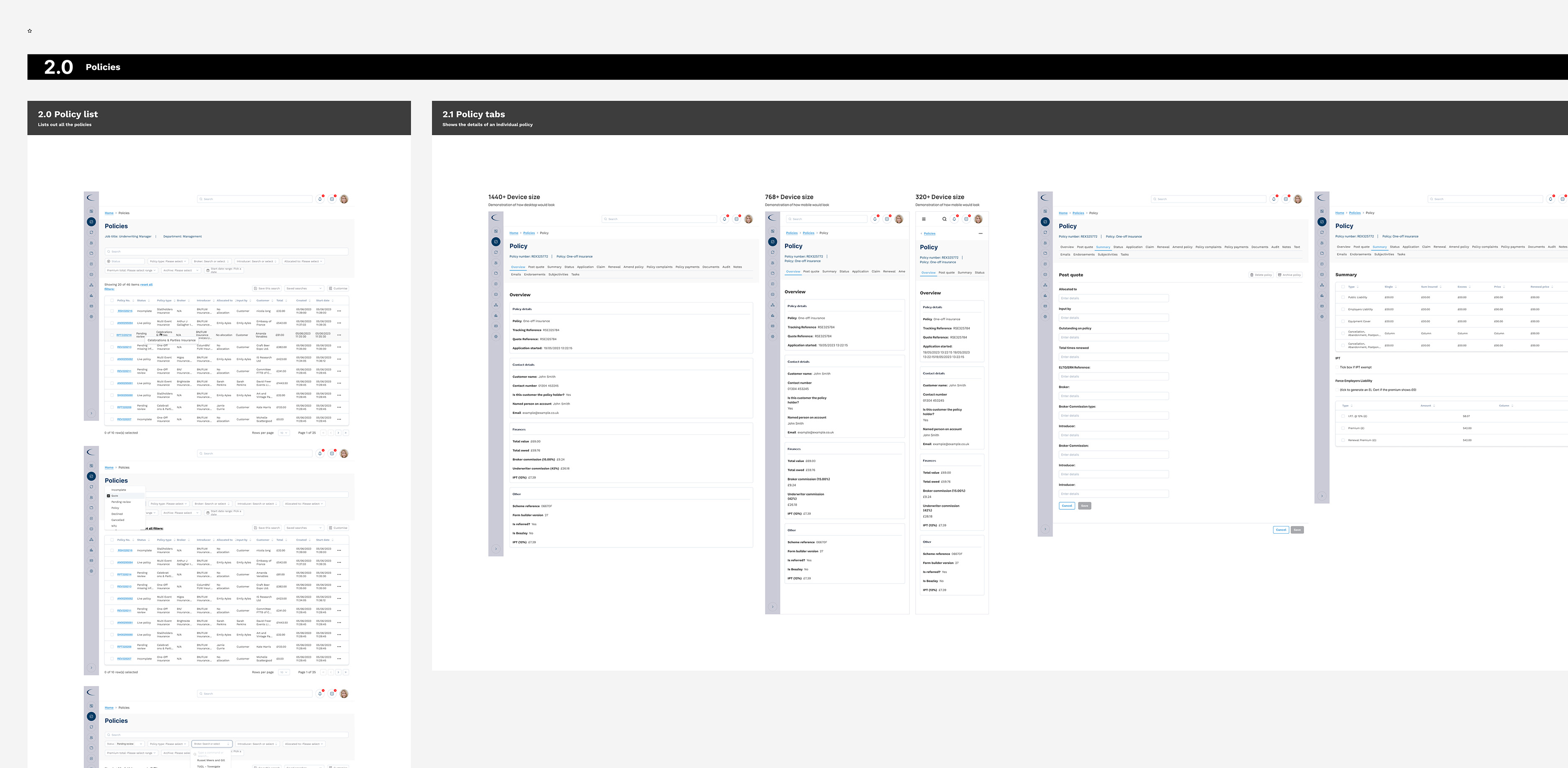
Wireframes
After a series of iterations, the wireframes was refined and transformed into a comprehensive wireframe prototype, providing a functional representation of the entire platform. However, as I progressed, I realised that due to the platform's size and screen complexity, it was necessary to break it down into individual areas (as outlined below). This process involved close collaboration with the client through multiple meetings to ensure that all features were adequately addressed and that the client's satisfaction was achieved by the end of the wireframing stage.
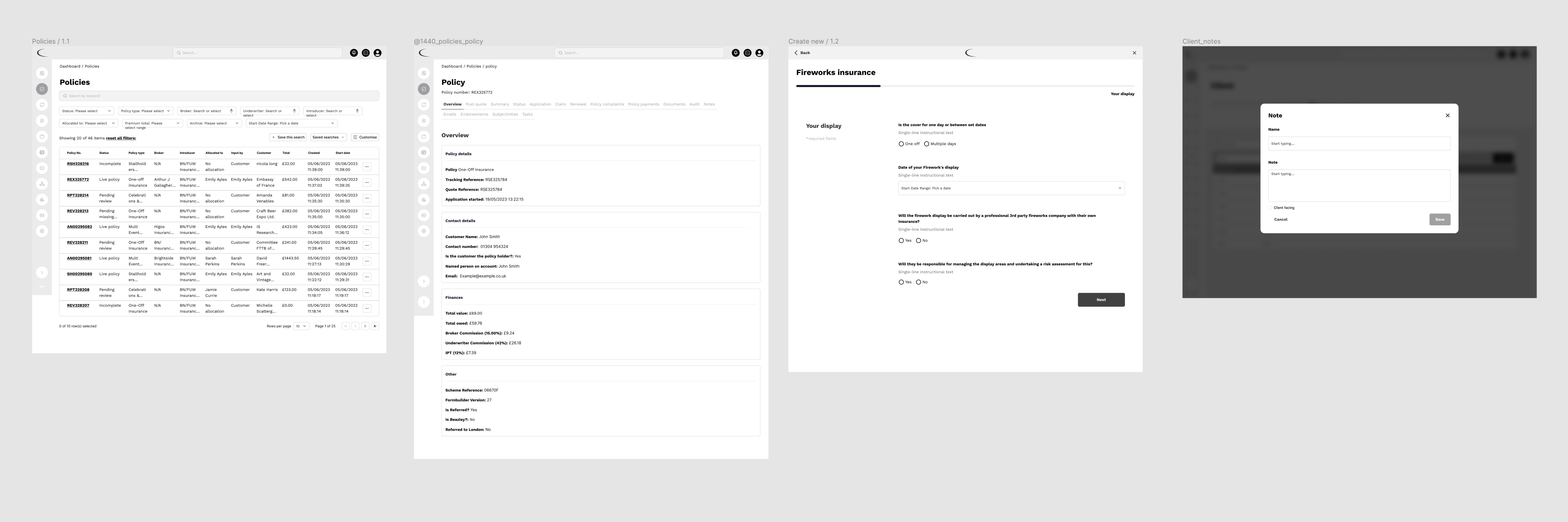
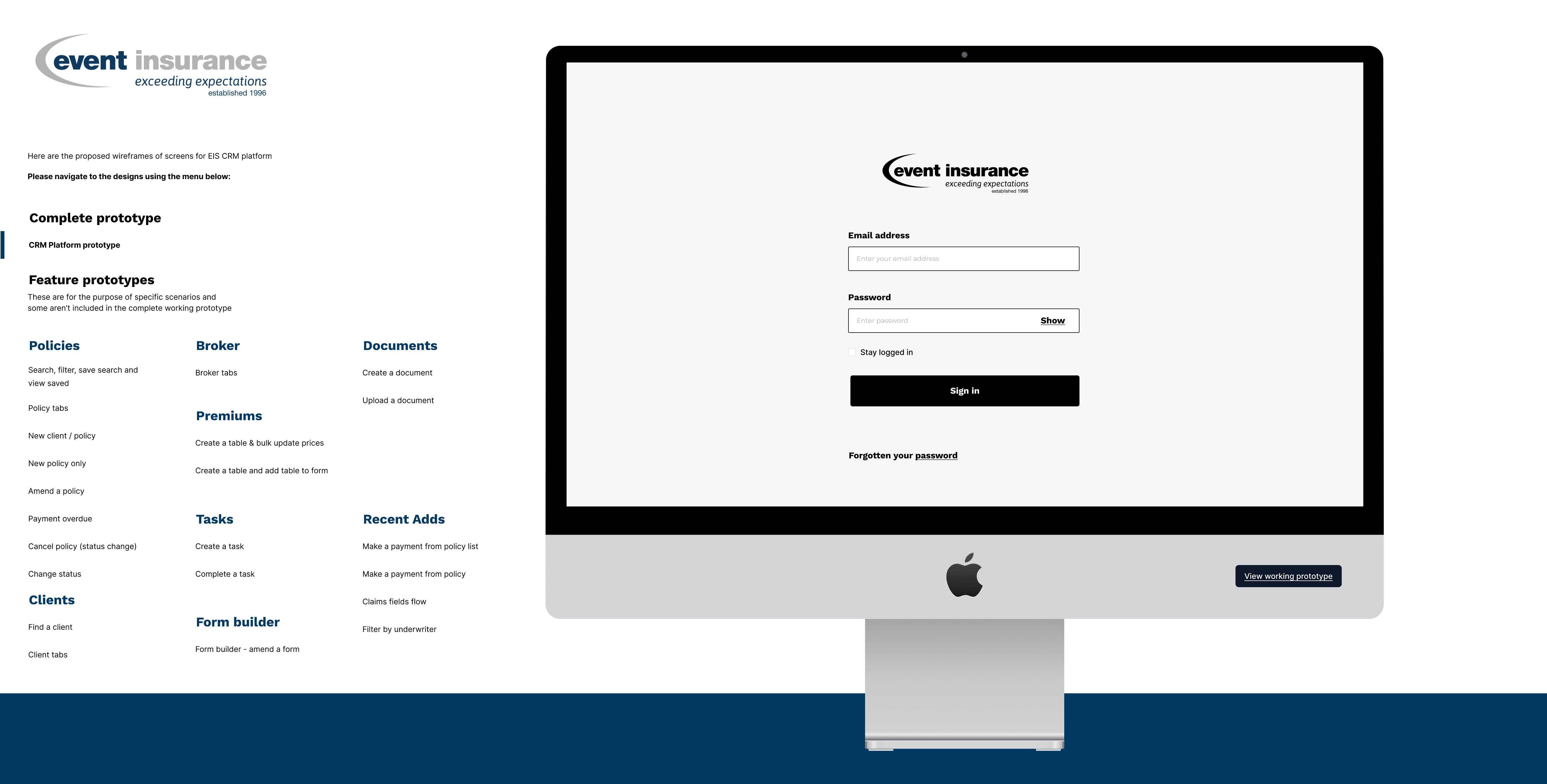
Presenting wireframes to client
To facilitate a smoother collaboration process and avoid overwhelming the client with a large wireframe prototype, I divided the wireframes into individual features. Handing over the entire prototype proved impractical due to its size and the limitations of tools like Figma. Instead, I presented each feature separately, accompanied by visual examples and a link to its specific prototype. This approach allowed the client to provide feedback on individual feature changes rather than evaluating the platform as a whole. This method proved highly effective, particularly when dealing with numerous features within the project scope.
Creating the design system
You can find the comprehensive design system details here. The design system was developed in Figma, with its dedicated file serving as a central source for both the CRM UI design and the subsequent EIS website. Following atomic design principles, I organised similar components into groups to minimise redundancy and streamline development efforts. For each component, I provided detailed documentation on its usage and specifications, making it easier for developers to implement and enabling other designers to seamlessly pick up the system in the future. This approach ensured consistency across designs and facilitated efficient collaboration among team members.

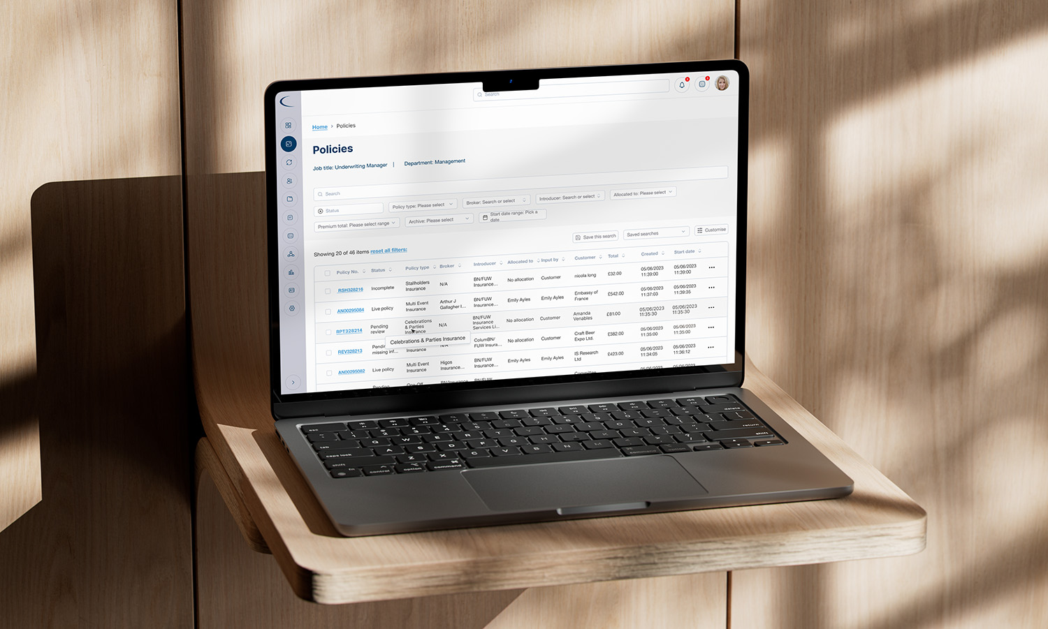
UI Design
Once the wireframes were approved, I commenced the UI design phase for the CRM platform. Simultaneously, I worked on creating the design system, designing components as they were added to the overall design. This parallel approach allowed for a seamless integration between UI design and the development of a comprehensive design system. By designing components in real-time and incorporating them into the overall interface, I ensured consistency and efficiency throughout the entire design process.