Holiday Maker App
UI
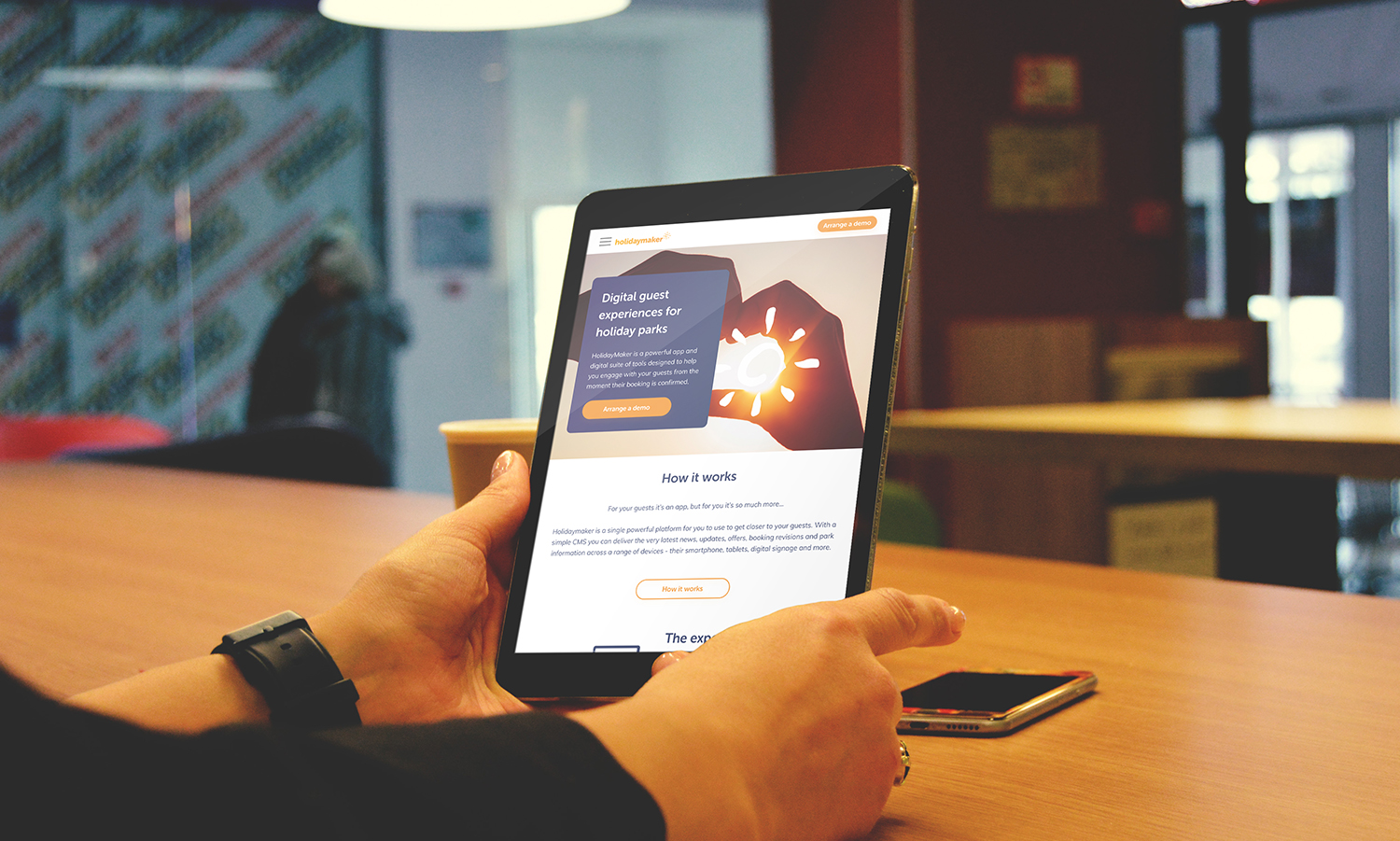
The holiday maker app homepage design
I was assigned the project of redesigning the homepage for the "Holiday Maker App" website because their existing site was not generating sufficient conversions. The current layout lacked the appropriate content blocks to encourage user engagement and click-throughs.
My role
UI Designer as a contractor for Key Digital Poundbury.
Planning the pages
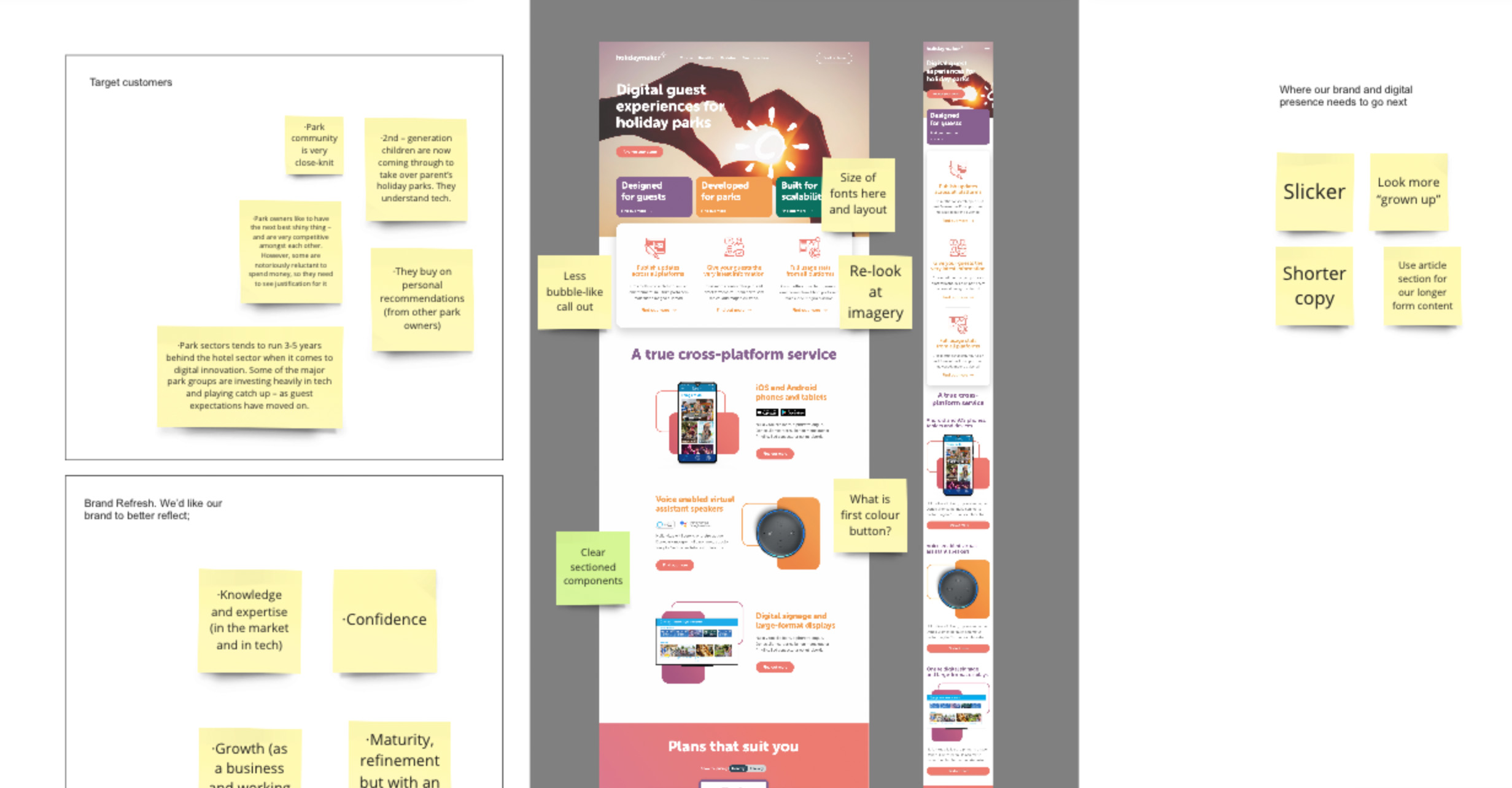
I began work in Miro where I undertook all my research for the Holiday maker app. This is where I looked at target customers, competitors then dived into wireframes. Initial thoughts...
Design system research
This is where I conducted some research on buttons and forms as I needed to recap and get inspiration for this project. One of the issues with the original website was the incorrect usage of primary and secondary call to actions - therefore I wanted to make sure installed the correct research behind the designs I put forward to the customer.
Page structuring
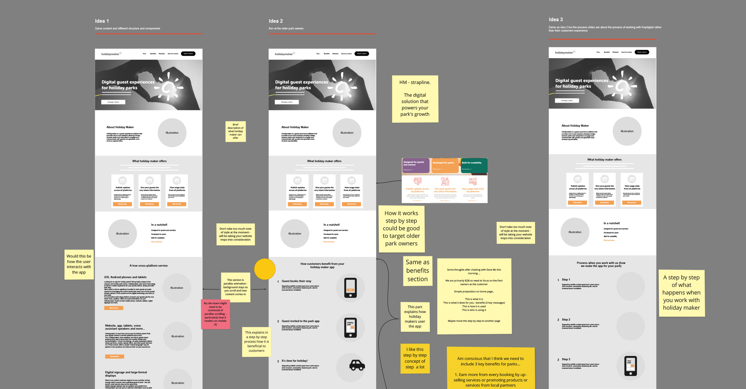
I developed a few layout ideas for the page to discuss with the client. Collaborating at the wireframe stage made is easier to incorporate feedback and make adjustments before moving on to the design phase.
Figma wireframes
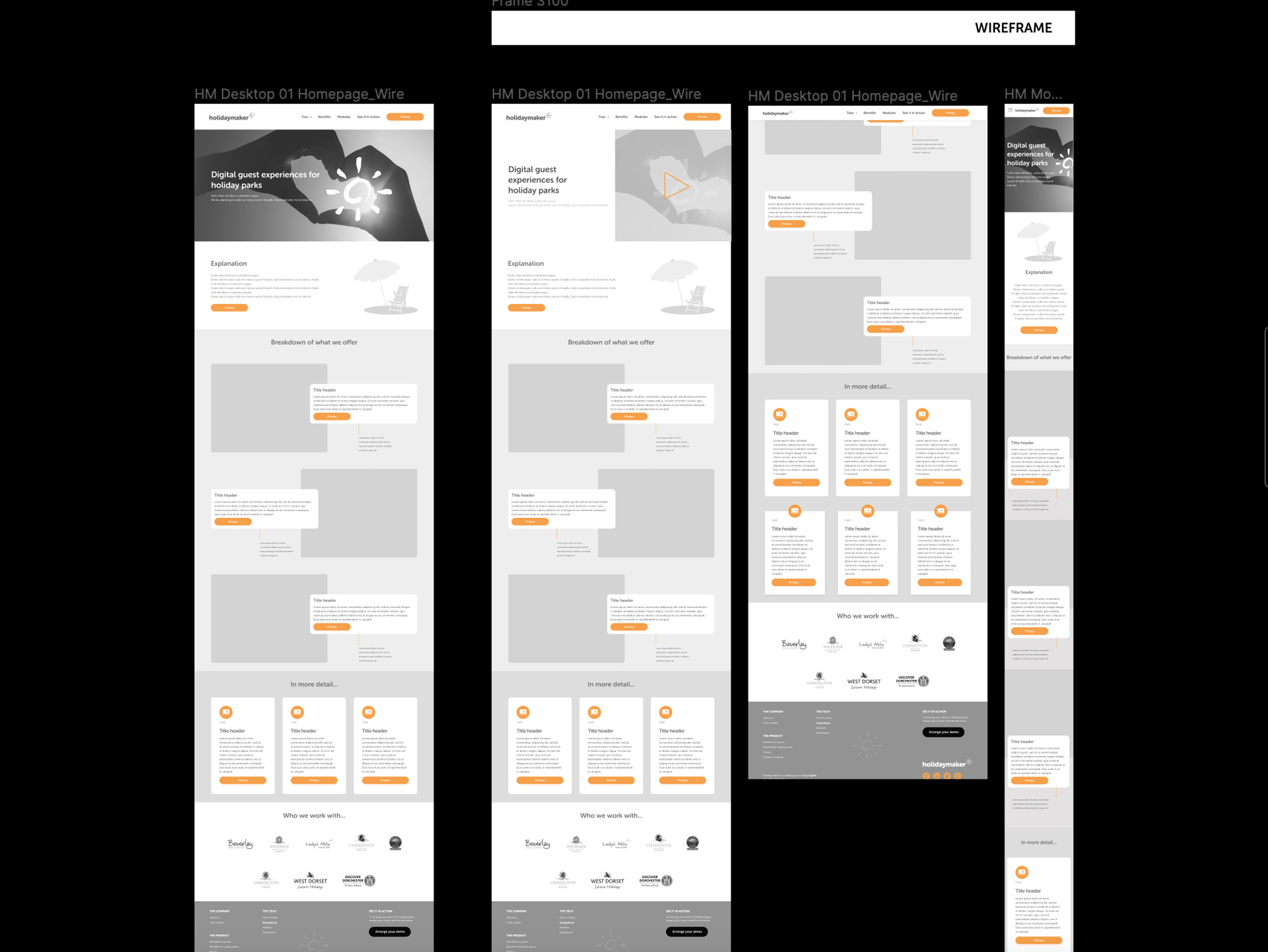
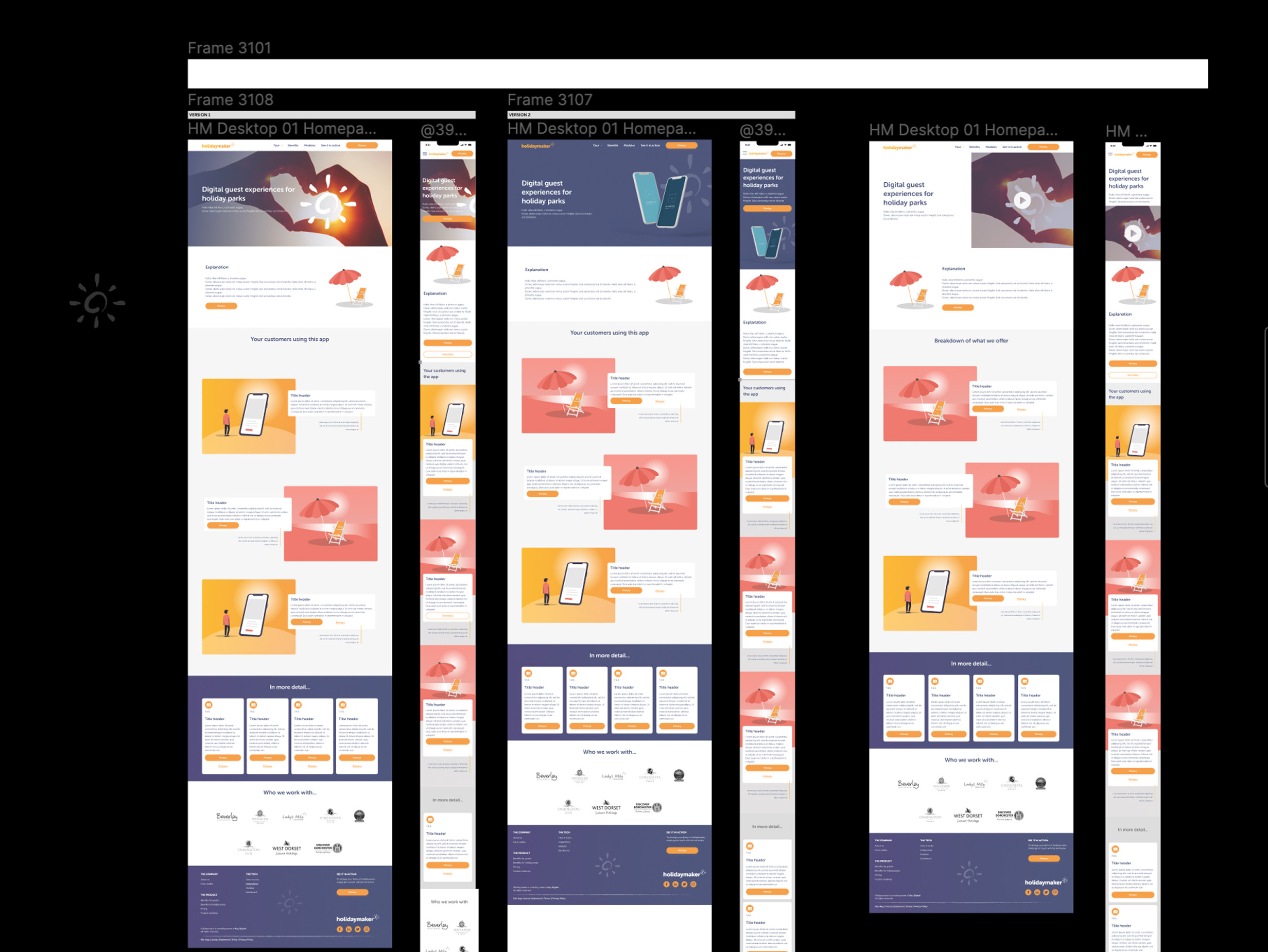
Once the client approved the page structure in Miro, I transitioned to Figma to build out the wireframes.
Initial designs
After wireframes I dived into UI designs, this is where I built up a small design system to cater for the components used. I used Figma to collborate with client at every stage of the design process.
Final designs
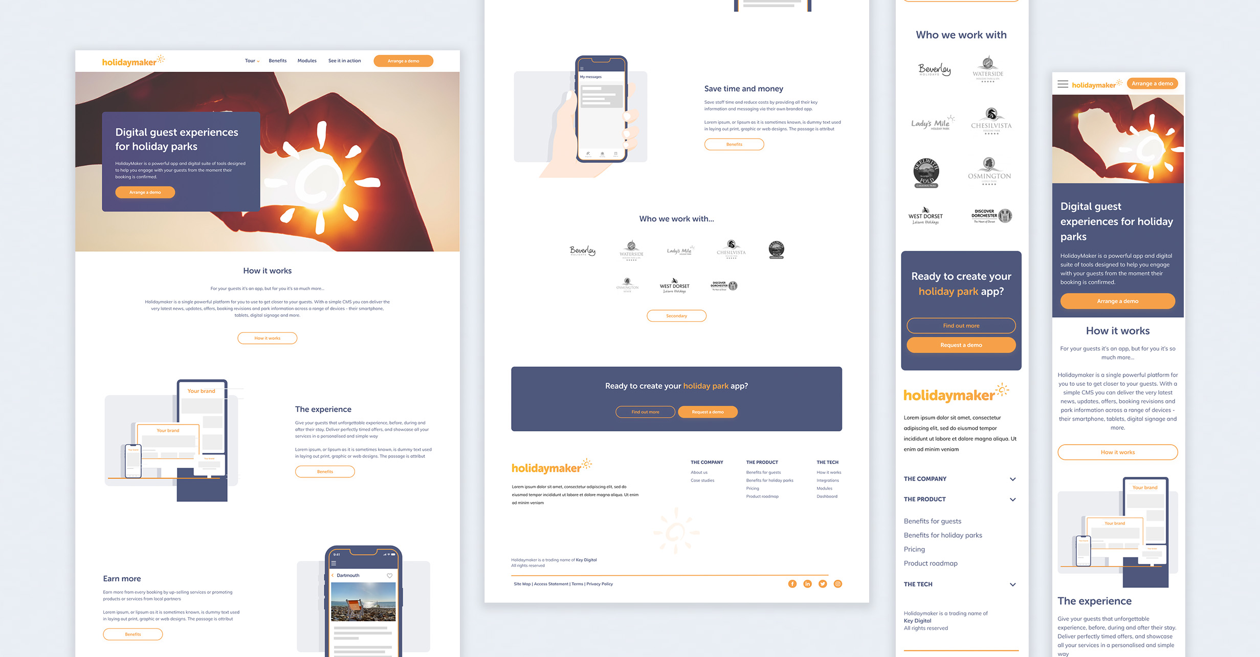
Here are the final designs ready to hand off to the development team at Key digital.
